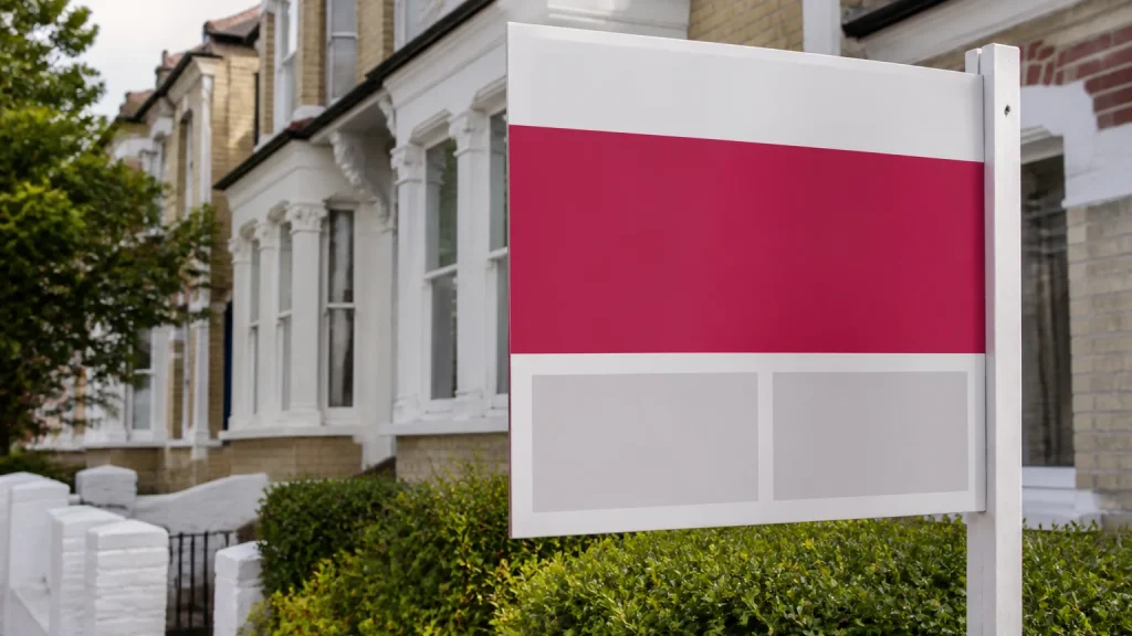
Printed estate agent boards UK work best when someone can understand who is marketing the property and how to take the next step at a glance. Put the lead agency or agreed shared identity first, give prospective buyers one obvious contact route, and use a short instruction only where it genuinely helps. This guide explains how to plan the information before ordering, including shared listings, call handling and viewing instructions.
⏱️ Estimated reading time: 5 minutes
Table of Contents
Start with the property’s primary message

A passing viewer should not have to work out whether a property is for sale, to let, sold subject to contract or available for viewings. Decide the main status before discussing logos, colours or secondary messages.
Where a property is being marketed by a single agency, this is straightforward. Use the brand elements that buyers recognise, then keep the phone number, website address or other approved response route easy to find. Avoid placing important contact information over a busy image, patterned background or colour transition. A board is viewed quickly, often from a distance, so clarity tends to matter more than fitting in a long sales message.
It may be tempting to add bedroom counts, property features, social media icons and several calls to action. Ask one blunt question: does this help a person identify the property’s status or contact the right office? If not, leave it out.
Printed estate agent boards UK for joint instructions
Joint instructions need an agreed hierarchy before artwork begins. If two agencies are marketing the same property, both brands may need to appear, yet the board still needs to look intentional rather than like two separate signs pushed together. Agree which agency receives enquiries, whether both phone numbers are needed, and who approves the final artwork.
A practical layout usually gives both brands a clearly defined area while retaining one shared property-status message. The priority should reflect the agreed customer journey, not simply internal preference.
For example, a hypothetical joint instruction may use both logos along the lower section of the board, with a single central phone number for the nominated viewing contact. If separate contact routes are essential, label them plainly rather than expecting people to infer which number belongs to whom.
Printed estate agent boards UK need one clear contact route
More contact options do not automatically make a board easier to use. A telephone number may suit a viewer who wants to call immediately, while a web address may be useful for someone who wants to browse later. Including both can work, provided they do not compete for attention.
Decide in advance where each route leads. A phone number should reach the team or process intended to deal with board enquiries. A web address should take the visitor to a relevant property page or a clear starting point, rather than a general page that forces them to search again. If a QR code is being considered, test it at the intended printed size and from a scanning distance before approval.
Keep contact details current across the whole board order. An old branch number or retired web address can make an otherwise polished board feel careless, and it creates avoidable work for whoever receives the enquiry.
Printed estate agent boards UK with viewing instructions
Viewing instructions deserve particularly careful wording. A board is not the place for a detailed booking policy, so use a concise direction that tells people what to do next. “Viewing by appointment” may be enough when the primary contact details are prominent. If viewings are managed by a different branch or partner, make that distinction obvious only when it changes the route the viewer should take.
Do not rely on small print to explain an important instruction. Fine text can be missed, especially when a board is seen from a pavement or passing vehicle. Equally, avoid urgent-looking wording unless it accurately reflects the agreed process. The board should guide interest calmly, not create confusion about access to the property.
Before printing, check the wording against the current marketing status and any instructions from the property owner. Planning controls and local requirements can apply to estate agent boards, so the party responsible for displaying the board should also check the applicable requirements before installation. A printer can produce the approved artwork, but cannot decide what is permitted at a particular property.
Common mistake: treating every board as a one-off
Estate agencies often need boards at different moments: new instruction, price change, sale agreed, let agreed, development launch or joint instruction. Ordering each variation from scratch can lead to inconsistent colours, mismatched contact details and last-minute artwork changes. A better approach is to create a small set of approved templates that preserve the core brand while allowing the status panel or contact information to change.
Keep a simple approval record for each version. It should state the board type, final wording, logos, contact details and the person authorised to sign it off. That makes a reprint easier to check and helps avoid using a previous version with outdated information.
When this does not make sense is when the property or campaign genuinely needs a bespoke layout. A prestige development, a co-marketing arrangement or an unusual board shape may need a fresh design rather than forcing the message into a standard template. In that case, provide the printer with the intended use, finished size, quantity, artwork files and any special requirements before requesting a quote.
Conclusion
Clear estate agent boards start with a simple decision: identify the property status, show the right agency identity and make the next contact step obvious. For joint instructions, agree the hierarchy and enquiry route before anyone starts designing. For viewing information, keep the instruction brief and ensure the responsible party checks applicable display requirements.
Newstyle Print supplies printed estate agent boards as part of its wide-format signage range, with bespoke print work available where a standard approach is not suitable. Preparing one approved brief for the board wording, brand assets, contact details and quantity will make the quote and artwork process much more straightforward.