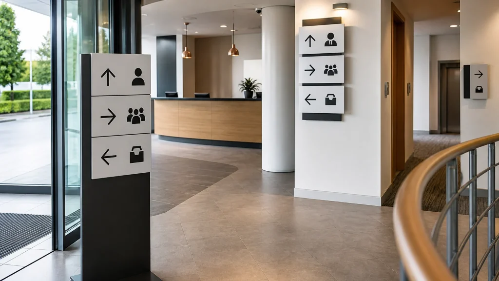
Custom signs help visitors navigate busy premises by answering practical questions before somebody has to ask them: where to enter, where to wait, which counter to use and how to leave. The most useful signage is planned as a simple route, not as a collection of separate notices. When wording, placement and format work together, visitors can move with more confidence while staff spend less time repeating directions.
⏱️ Estimated reading time: 6 minutes
Table of Contents
Map the visitor journey before ordering custom signs
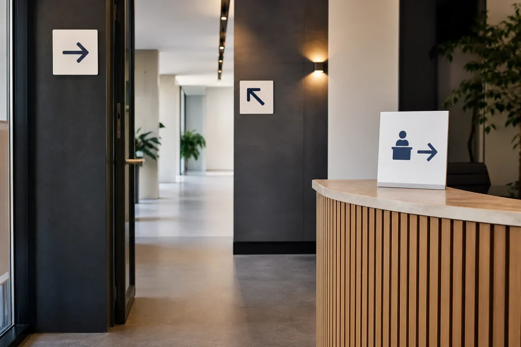
Start at the point where a person first arrives. Follow the route as if you had never visited before, noting every point at which you would need to make a choice.
For many businesses, those moments include finding the correct entrance, joining a queue, checking in, locating a counter, using a collection point and identifying the exit. A sign should support one decision at a time. Trying to explain the whole building on one board often creates more hesitation, not less.
- Arrival: identify the right entrance or reception point.
- Orientation: show what happens next, such as check-in or queueing.
- Choice points: direct visitors towards the correct service area, room or counter.
- Departure: make exits, returns points or collections easy to spot.
Give each sign one clear job
Lead with the instruction or destination rather than a long explanation. “Collect orders here” is easier to take in at a glance than a paragraph about the collection process. If extra detail is genuinely needed, place it where people are already waiting rather than at the moment they need to decide which way to turn.
Keep names consistent across the premises. If the first sign says “Customer Collection”, do not call the same area “Pick-Up Point” on the next one. Small differences can cause doubt, especially where several services sit close together.
Branding matters, but it should not compete with the practical message. Your logo, colours and type style can make a set of signs feel joined up. The destination, arrow or instruction needs to remain the obvious priority.
Choose custom signs for the viewing situation
The best format depends on where the sign sits, how close people will be and whether the message needs to move with the business. Newstyle Print offers custom-cut signs, Foamex boards, Correx boards, Dibond boards, self-adhesive vinyl and A-frames, so a project can use different printed pieces for different points on the route.
| Visitor need | Useful signage approach | What to decide first |
|---|---|---|
| Find the entrance | An exterior-facing board, vinyl graphic or A-frame | Where visitors approach from and what they can see |
| Understand a queue | Counter, wall or freestanding directional signage | The start of the queue and its expected direction |
| Choose a service point | Clear signs at or above each area | The exact service name visitors should recognise |
| Follow a changing route | Separate signs that can be updated or repositioned | Which information is temporary and which remains |
There is rarely one material that suits every location. A permanent-looking reception message and a short-term queue instruction may call for different solutions. Explain the intended setting, fixing method and whether the message changes often when requesting a quote; those details shape a sensible recommendation.
Make custom signs readable at the point of decision
Readability is not simply about making everything large. It is about giving the most important information enough space and contrast. A directional sign needs a clear destination and arrow. A counter sign may need only a short label.
Stand where the visitor will stand before finalising artwork. Check what sits behind the proposed sign, whether shelving, displays or doors interrupt the view, and whether several messages compete nearby. A well-designed board can be missed if it is placed after the decision point or hidden among unrelated notices.
For a hypothetical busy clinic reception, an arrival sign could direct patients to check in, while separate signs identify the waiting area and collection desk. Repeating the same colours and labels helps the route feel coherent, but each sign still gives one immediate instruction.
Ask a colleague who does not know the space to follow the route using the draft wording. Their questions can reveal gaps that familiar staff may no longer notice.
Common mistakes that make routes harder to follow
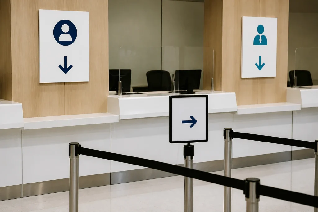
The common mistake is treating signage as decoration added at the end of a refurbishment, launch or event plan. By then, available wall space and visitor flow may already be working against it. Another frequent problem is placing every rule, offer and instruction on the same sign because there is room on the artwork.
Avoid relying on colour alone to distinguish destinations. Pair colour with clear labels, symbols where appropriate and consistent wording. Also resist using arrows without checking the final mounting position; an arrow that made sense in a proof can become misleading when a sign is moved.
Do not assume a sign solves a route problem by itself. If visitors must pass a locked door, cross a queue or ask permission before entering an area, the wording should explain the next action plainly. Clear signs support a workable process; they cannot repair a confusing one.
When custom signs may not be the right answer
Custom signs do not make sense when the underlying process changes every few hours and staff need to give different instructions each time. In that case, a reusable display, a temporary notice system or a review of the process may be more practical than producing fixed signage.
They are also less useful when a single staff conversation is necessary, such as checking an appointment or confirming access. Signage can direct visitors to the right person, but it should not pretend to replace information that needs individual judgement.
Conclusion
Good visitor navigation begins with the route, then matches each decision point with a concise, visible instruction. Custom signs work best as a coordinated set: clear arrival information, consistent directions, distinct service labels and a sensible format for each location. Before printing, walk the route, simplify the wording and check that every sign has one job. A detailed brief covering locations, messages, approximate sizes and artwork requirements will make it easier to plan a bespoke signage order with Newstyle Print.