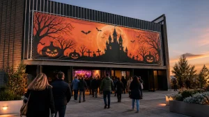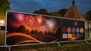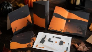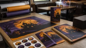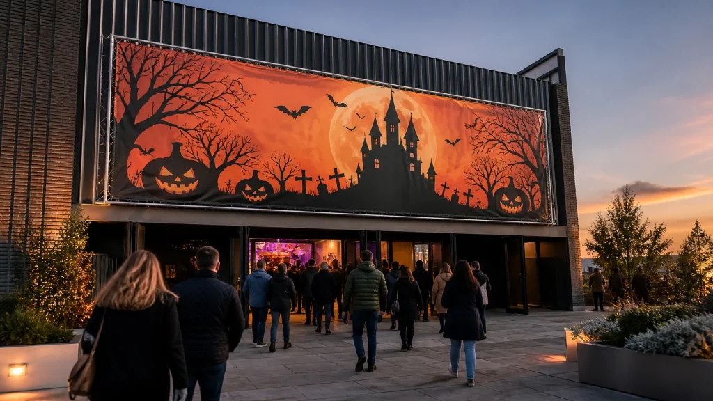
Large Halloween banners are most effective at busy venue entrances when they answer the visitor’s first questions quickly: where to go, what is happening and whether any immediate action is needed. Plan the banner around the approach route, available display space and one dominant message, then use smaller signs for details that change.
⏱️ Estimated reading time: 5 minutes
Table of Contents
Large Halloween banners start with the approach route
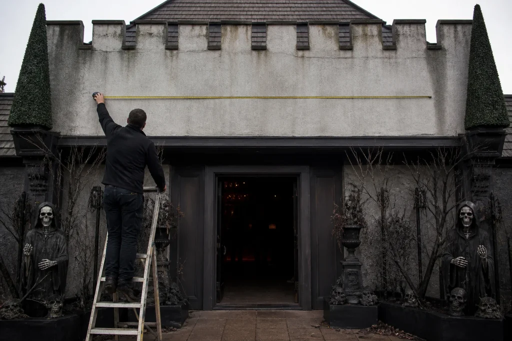
Stand where a first-time visitor is likely to arrive, then look towards the entrance. This simple check may show that a banner must be understood across a car park, from a pavement, through a window or while people are joining a queue. The closest fixing point is not always the most useful viewing position.
Think about the journey in stages. From further away, people may only register the venue name, a Halloween graphic and a short invitation such as “Halloween Nights”. Closer to the entrance, they can take in dates, opening information, booking prompts or a specific activity. Trying to make every detail readable at every point usually makes the whole banner harder to use.
Decide which item has the lead role. A large entrance banner might announce the event, while a nearby sign handles queue instructions or times.
Match banner layout to the entrance space
Measure the usable display area, not simply the wall or fence behind it. Allow for doors, windows, railings, fixtures, sightlines and the fixing arrangement that will be used.
A long horizontal space often suits a short headline beside a bold character, logo or seasonal illustration. A tall, narrow area may work better with a vertical message, a simple directional cue or one striking image. The right orientation depends on the surface and the direction from which visitors approach.
| Entrance situation | Useful banner priority |
|---|---|
| Visitors arriving from a distance | A short headline, venue identity and one clear visual |
| Busy doorway or queue point | Entrance identification and any immediate instruction |
| Retail frontage | A seasonal promotion that supports the window display |
| Large blank wall or fence | A wider campaign message with room for branded artwork |
For example, a hypothetical family venue with a roadside approach might use one broad banner to establish its Halloween event, followed by a smaller supporting sign near the door for arrival details. Separating those jobs can be more useful than filling one large display with every instruction.
Write a message people can absorb quickly
Large format gives you room, but it does not require content in every available area. Start with the one phrase a visitor should remember. It might be the name of a Halloween trail, a themed dining offer or a prompt to enter. Put that message in the most prominent position and make it noticeably larger than supporting copy.
Contrast deserves attention before decorative effects. Pale type over a detailed pumpkin, cobweb or night-sky image may look appealing on screen but lose clarity at a distance. A solid colour area, a quieter part of the image or a simple panel behind text can give the wording a clearer place to sit.
Keep wording direct and specific to the job. “Spooky season has arrived” may suit a broad retail campaign, while “Halloween trail entrance” is more helpful where visitors need to find a particular location. If tickets, times or conditions matter, consider placing them on a separate nearby notice. A banner should not require people to stop and read a paragraph before they know where to go.
Large Halloween banners need a clear artwork brief
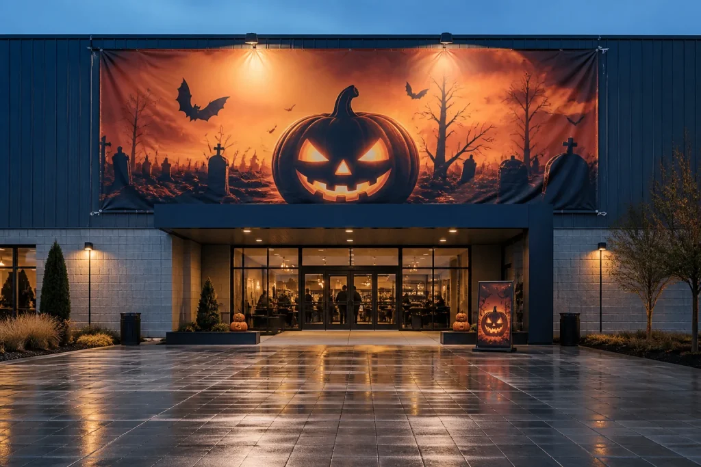
Before artwork is supplied, agree the finished banner size, orientation, display location and the information that must appear. These details shape the layout from the outset. Changing a landscape entrance banner to portrait late in the process can alter the reading order, crop an image or make a logo appear disproportionately small.
Use the printer’s current artwork specification for file setup, including any bleed, safe area and preferred file format. Important wording, logos and faces should not sit close to the finished edge because trimming or finishing requirements may affect them. Check the final proof for spelling, dates, web addresses, phone numbers and branding before approval. Seasonal campaigns often have several versions, so an older detail can easily remain in one file.
Newstyle Print provides wide-format printing, including PVC banners, alongside graphic design support for businesses that need help developing or adjusting artwork. For an unusual entrance shape, a non-standard size or a coordinated set of printed displays, a bespoke quote may be more suitable than forcing the job into a standard layout.
Decide whether a large format is necessary
A large banner is not automatically the best answer for every entrance. If visitors are already close to the message, a poster, A-frame, window graphic or smaller sign may be easier to place and quicker to read. A venue with several changing activities may also benefit from a fixed seasonal banner with replaceable supporting signs, rather than one display carrying information that will soon be out of date.
A common mistake is choosing the largest format before deciding what the display needs to achieve. Bigger artwork cannot compensate for an unclear message, awkward positioning or poor sightlines. Another mistake is treating a promotional banner as the only source of visitor information. Separate directional or operational signage can keep an entrance clearer at busy times.
Check the practical display plan too. Confirm who will fit the banner, what fixing points are available and whether the selected material and finishing suit the intended location. Those points should be discussed with the printer for the specific order rather than assumed from a previous display.
Conclusion
The most useful large Halloween banners begin with the real entrance experience rather than a blank design template. Measure the usable space, consider viewing distance and choose one main message before adding seasonal artwork. Keep changing details on supporting displays where possible, and prepare a brief covering location, size, artwork and purpose before requesting a print quote. That approach gives the printer the information needed to suggest a banner arrangement that fits the venue and the campaign.