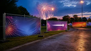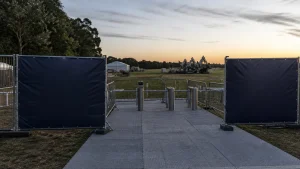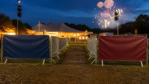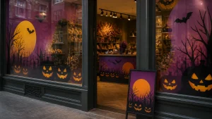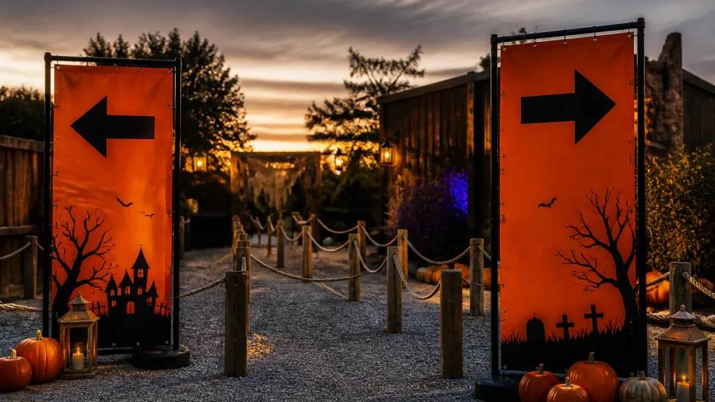
Halloween banner printing can make a queue entrance much easier to recognise. The most useful banner does one job: it confirms where a particular queue begins. Treat it as wayfinding rather than decoration. A seasonal design can still set the mood, but the entrance message, direction and any essential distinction between queues need to be understood at a glance.
⏱️ Estimated reading time: 5 minutes
Table of Contents
For a Halloween attraction, trail, shop event or ticketed evening, start by mapping the visitor’s first few decisions. Where do they arrive? Which route should they join? Is there a separate access, collection or pre-booked entry point? A banner placed at the actual decision point is often more valuable than one positioned further back as general promotion.
Plan Halloween banner printing around the arrival route
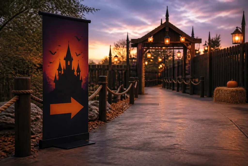
Walk the route. Look for the point where a person may hesitate, turn towards the wrong door or join the wrong line. That is normally the best location for the first queue banner.
Give each banner a defined purpose. An entrance banner identifies the start of a line. A directional banner points people onwards. A reassurance banner can explain what a queue is for, such as ticket holders or a particular timed session. Trying to make one banner do all three leads to a crowded layout and a message that is slower to read.
What should a Halloween queue entrance banner say?
Put the queue name or instruction first. Phrases such as “Entry queue”, “Ticket holders” or “Collect tickets here” are clearer than a dramatic headline. Seasonal language and imagery can support the message, but they should not compete with it. If an instruction needs reading while people are walking, keep it brief and place it where the eye is likely to land first.
Useful information may include:
- the queue’s purpose or visitor group;
- a simple arrow where a change of direction is needed;
- an identifiable event name or venue mark;
- a short instruction, if it genuinely helps; and
- an alternative route only when people must make a choice there.
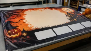
Use one clear visual hierarchy: the main queue label largest, the direction or arrow next, then supporting words. Decorative cobwebs, pumpkins or dark textures can establish a Halloween feel, yet they should stay out of the area needed for the message. Strong contrast between lettering and its background matters more than choosing traditional orange and black. A pale typeface over a detailed moonlit image, for instance, may look atmospheric on screen but be awkward to read in a real queue.
Halloween banner printing needs a practical display brief
The print brief should explain how each banner will be used, not just how it should look. Include the proposed location, finished size, whether it will be viewed mainly from nearby or across an open approach, the direction visitors travel and the fixing plan. Newstyle Print offers PVC banners alongside other wide-format display products, and a bespoke enquiry is sensible when standard products do not suit the site or message.
Ask the printer about the appropriate material, finishing and fixing options for the intended location. Suitability can depend on exposure, support structure, duration and how the banner will be secured, so it is unwise to assume one format suits every entrance. Keep important wording away from edges and fixing areas. The supplied artwork should also allow for trimming and finishing requirements confirmed for the chosen product.
Photographs and detailed illustrations deserve a careful check. They can work well as atmosphere around a simpler message, but a full-banner image rarely replaces a readable instruction. If the event brand relies on dark artwork, consider reserving a clean panel for the queue label rather than forcing type over the busiest part of the design.
Avoid making every Halloween banner printing piece a promotional poster
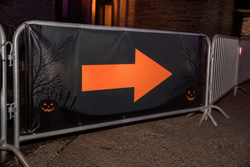
A promotional banner persuades someone to attend; a queue banner helps someone who has already arrived. Those are different tasks. The common mistake is to reuse a campaign design full of dates, ticket information, social prompts, sponsor logos and decorative detail, then place it at the entrance. It may look on-brand, but it does not necessarily answer the visitor’s immediate question: “Is this my queue?”
Another problem is relying on colour alone to separate routes. Colour may be useful, though visitors can miss it in poor light or when several displays sit together. Combine colour with a distinct queue name, simple icon or clearly different heading. Avoid near-identical labels such as “Entry” and “Main Entry” unless the distinction is obvious to people who have not read the event plan.
Before artwork is approved, ask someone unfamiliar with the layout to identify where they would stand for each route. If they pause, reinterpret the wording, or point somewhere else, the message probably needs simplifying. A proof check should cover spelling, event details, logo versions, arrows and the display orientation as well as appearance.
When a banner is not the right answer
A banner may not make sense where information changes frequently, space is very limited or visitors need detailed instructions close up. In those cases, a smaller rigid sign, A-frame, poster or staff-managed point may be more appropriate. Newstyle Print supplies several signage and display formats, but the best choice depends on the site, the available support and what visitors need to decide.
Do not use a banner as the only answer to a complicated arrival process. If people need to check tickets, receive wristbands, find accessible access or choose among several timed sessions, use a sequence of clear touchpoints. A banner can mark the start, while other printed signs provide the detail at the moment it is needed.
Conclusion
Well-planned Halloween queue banners make arrivals calmer by showing people exactly where to go before they need to ask. Keep the entrance message short, give each display one role and plan the artwork around the route rather than the campaign alone. When preparing a print brief, include the location, message, viewing direction and fixing needs so the finished banner can be matched to the practical job it needs to do.