
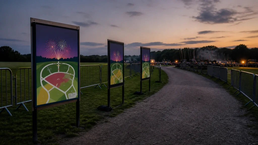
Firework event posters can clarify viewing areas when they give each location one simple purpose: helping visitors identify where they can watch, how they enter that area and what they need to do next. A poster is not a replacement for formal safety planning or steward guidance, but it can make approved visitor information easier to spot and understand in a busy setting.
⏱️ Estimated reading time: 6 minutes
Table of Contents
The strongest approach is to treat posters as location-specific information, rather than squeezing the entire event plan onto every sheet. A poster at an entrance has a different job from one beside a viewing field, food area or accessible route. Once that distinction is clear, the content, format and quantity become much easier to plan.
How Firework event posters clarify viewing areas
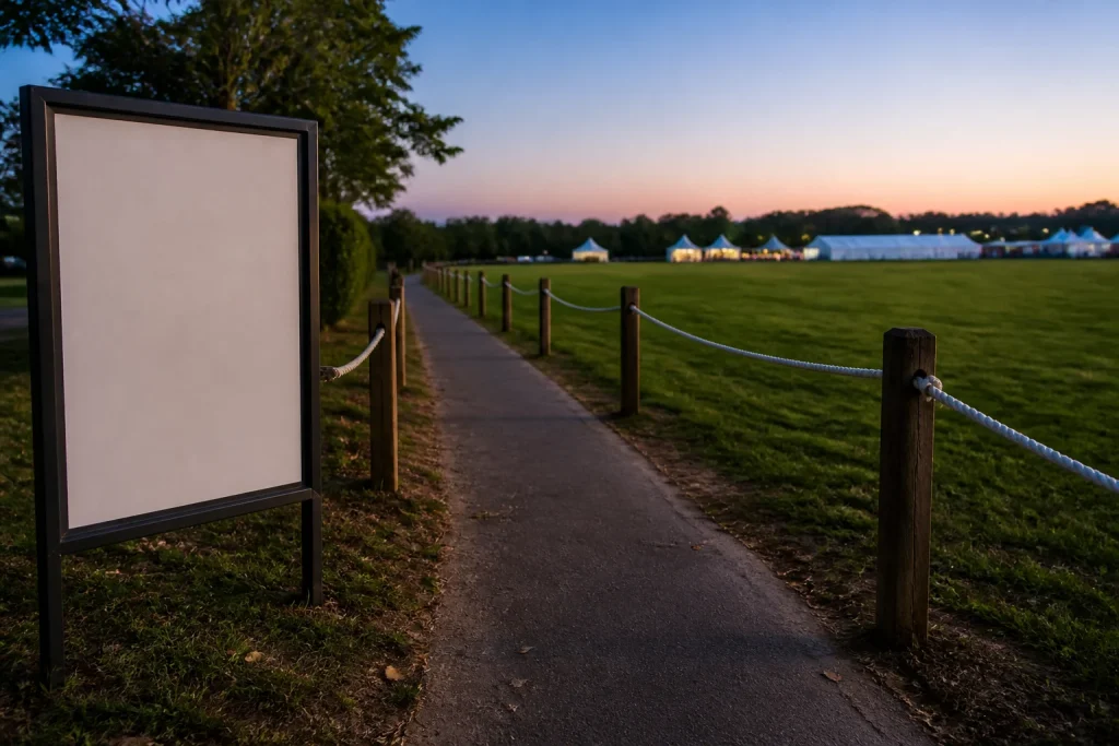
For example, a poster at a path junction might say “Main Viewing Area” with a simple directional cue, while a display at the edge of that area can state the approved viewing guidance supplied by the organiser. The first sign answers “where do I go?”; the second answers “what applies here?”. Combining both messages on every poster often makes neither one easy to absorb.
Use the same name everywhere it appears. If a printed map says “North Field Viewing Area”, avoid calling it “Main Field” on a poster and “Family Viewing” on social media.
Start with the visitor decision at each location
Before writing any artwork, list the decisions a visitor needs to make from arrival to departure. This gives the poster scheme a practical structure and helps separate essential information from useful but non-urgent detail.
- On approach: Which entrance should the visitor use?
- At admission: Which viewing area, route or facility applies to them?
- At a junction: Should they continue, turn, queue or ask a member of the event team?
- At the viewing area: What information does the organiser want people to notice before settling in?
- When leaving: Which exit or collection point should they follow?
This sequence stops one common mistake: designing a promotional event poster first, then attempting to bolt operational information around its edges.
In a hypothetical community event, the organiser may have a main viewing lawn and a separate quieter space. A single poster near the entrance could show both names and indicate the approved route to each. Once visitors reach either space, a second poster can concentrate only on the relevant area. That layered approach reduces repetition without assuming that everyone has seen a map beforehand.
Build a hierarchy that works at a glance
People do not normally stand and read every line of a poster at an event. Make the most important item the largest and clearest element: usually the viewing-area name, direction or immediate instruction.
A workable hierarchy often has four levels. First comes the area name or key instruction. Second is a short explanation, such as the entrance route or whether the area is currently in use. Third is any supporting practical detail the organiser has approved.
Choose clear contrast between wording and background, and avoid placing important type over a detailed fireworks photograph. Firework imagery can create the right atmosphere for promotional posters, but it is rarely helpful behind directional wording.
Keep sentences short. “Viewing area this way” is easier to scan than a paragraph explaining the site layout.
Choose poster versions by purpose, not just size
Poster size matters, although the right choice depends on the intended position, viewing distance and available mounting space. Rather than selecting one size for every location, group the job by purpose. Promotional posters, arrival posters and close-up information notices may need different formats and quantities.
| Poster purpose | Main content | Useful planning point |
|---|---|---|
| Pre-event promotion | Date, venue, booking or event details | Keep the call to action separate from on-site instructions. |
| Arrival point | Entrance, ticket or route information | Use only details visitors need immediately. |
| Viewing-area marker | Area name and approved local guidance | Match the name used on maps and other displays. |
| Information point | More detailed schedule or facilities information | Give this poster enough space for people to pause safely. |
For a small number of versions or a late-approved update, digital printing may be a sensible option because it can suit shorter runs and separate designs. Where the same artwork will be used in larger quantities, litho printing may be worth discussing.
Common mistakes with Firework event posters
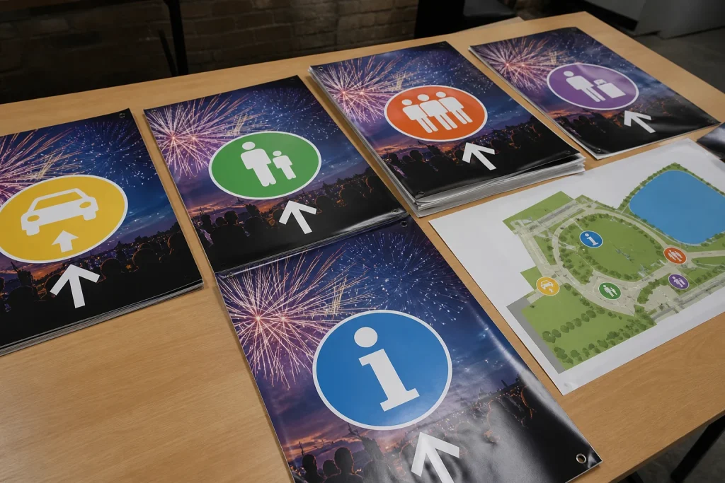
The most frequent problem is trying to make one poster serve every audience. Visitors need clear directions; volunteers may need operational notes; sponsors may need visibility; organisers may want to promote future events.
Another mistake is printing before the event team has agreed the final wording, area names and version number. Last-minute changes happen, especially where access arrangements depend on site conditions or organiser decisions. Keep an approved master list of wording and give every artwork version a clear reference, such as “Viewing Area A, version two”. That makes it easier to identify which files and printed items are current.
Do not assume a poster will stay readable in every environment. Lighting, placement, fixing method and the way visitors approach it all affect whether it can be seen.
When posters are not the right answer
Posters do not make sense as the only communication method when instructions are changing rapidly, when visitors need detailed assistance, or when information must be actively managed by trained staff. They are also a poor substitute for official notices, site controls or event safety procedures.
In those cases, posters may still play a supporting role: they can identify an information point, label an agreed viewing area or direct visitors towards a member of the event team. The key is to be honest about what print can do. A clear poster supports a planned visitor journey; it cannot resolve an unclear plan.
Conclusion
Firework event posters work best when each one answers a single location-based question, from finding the right entrance to recognising an approved viewing area. Agree area names first, give the main message visual priority and create separate versions for promotion, arrival and on-site guidance. With an organised brief covering artwork, quantities, intended locations and any changeable details, you can choose printed posters that support a clearer event layout without asking one display to do everything.