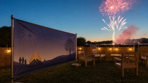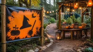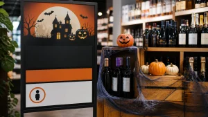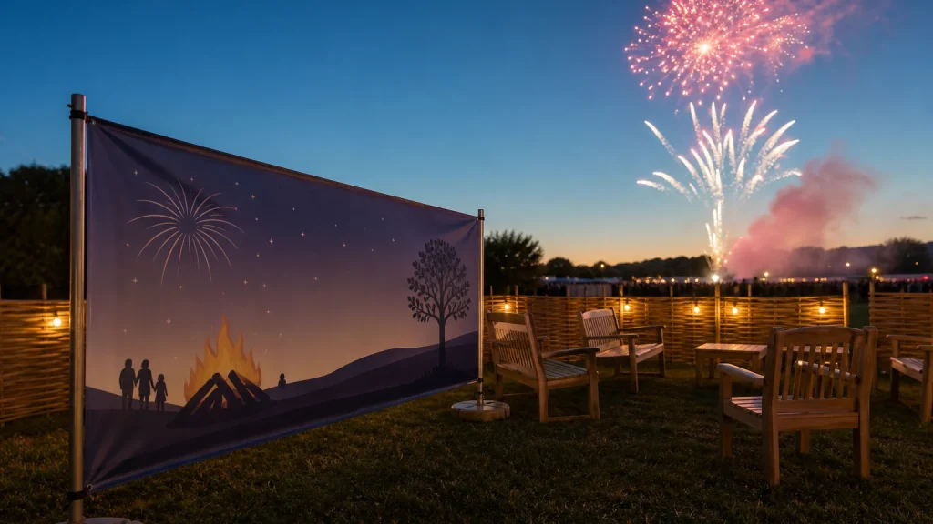
Custom Guy Fawkes banners can mark quiet zones clearly when they use a short, welcoming message, are placed before visitors need them and do not compete with louder event information. At a busy Bonfire Night event, a banner can help people find a calmer place to sit, regroup or step away from the main activity. The aim is not to explain every detail on one display. It is to make the area easy to recognise at a glance.
⏱️ Estimated reading time: 6 minutes
Table of Contents
- Why a quiet-zone banner needs its own purpose
- Custom Guy Fawkes banners need one calm message
- Place the banner before visitors need the space
- Make the artwork easy to scan at a distance
- When custom Guy Fawkes banners are not the right answer
- Prepare custom Guy Fawkes banners with a useful brief
- Conclusion
Why a quiet-zone banner needs its own purpose
Fireworks events often need several kinds of signage: entrance information, ticket directions, food areas, toilets, first aid and exits may all need attention. A quiet-zone banner serves a different job. It should reassure visitors that a lower-stimulation area exists and show them where to go, without making the space feel clinical, hidden or exclusive.
Details about what is available in the area can be provided on a separate sign closer to the space.
Custom Guy Fawkes banners need one calm message
Choose wording that is direct but considerate. “Quiet Area”, “Calmer Space” or “Need a Quieter Spot?” may work better than a long explanation. The best phrase depends on the event’s tone and the location of the banner, but it should be understandable without reading a paragraph.
- Use one primary label, rather than several competing descriptions.
- Keep the event name or logo smaller than the location message.
- Use an arrow only when the direction is unambiguous from where the banner will stand.
- Reserve phone numbers, timetables and sponsor lists for other event materials.
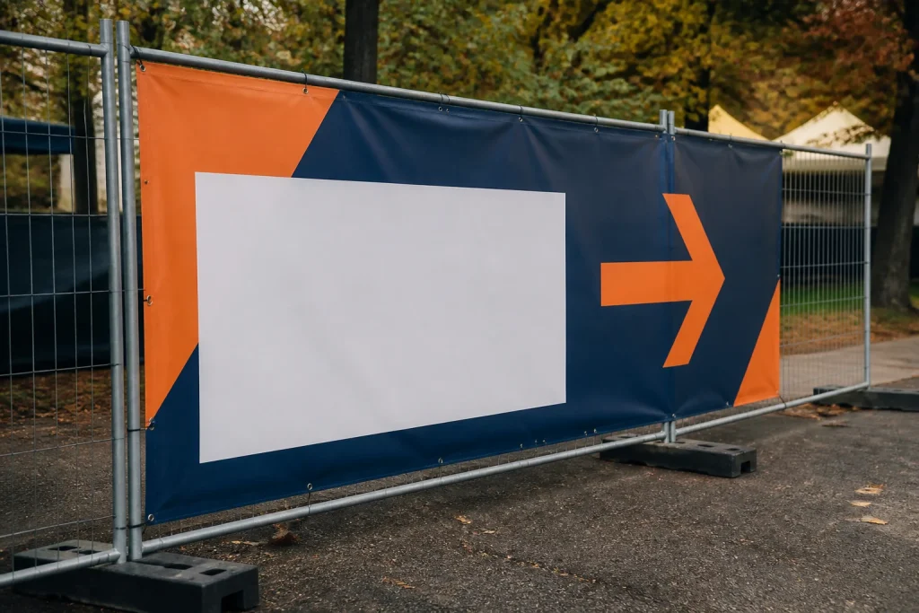
In a hypothetical school or community event, a banner at the entrance could simply state “Quiet Area This Way”, with a large arrow. A second banner outside the area might say “Quiet Area” and include a brief note about respecting the space. Each display then has one job, rather than asking a visitor to process several instructions at once.
Place the banner before visitors need the space
A banner placed only at the quiet area helps people confirm they have arrived, but it may not help someone who does not know the area exists. Consider the points where visitors make choices: after entry, at a junction between activity areas, or along the route from the busiest part of the venue.
Viewing conditions deserve a check too. A design that looks clear on a screen may be harder to read from across an open field, among colourful stalls. Stand at the intended viewing point and ask what a person can identify first. If the answer is the event logo, a decorative firework graphic or a block of small copy, the hierarchy probably needs work.
Visitors should not have to pass through the noisiest part of the site to find it. Where possible, show the route from more than one approach and keep directional wording consistent. A sign sequence may be more useful than one oversized display placed late.
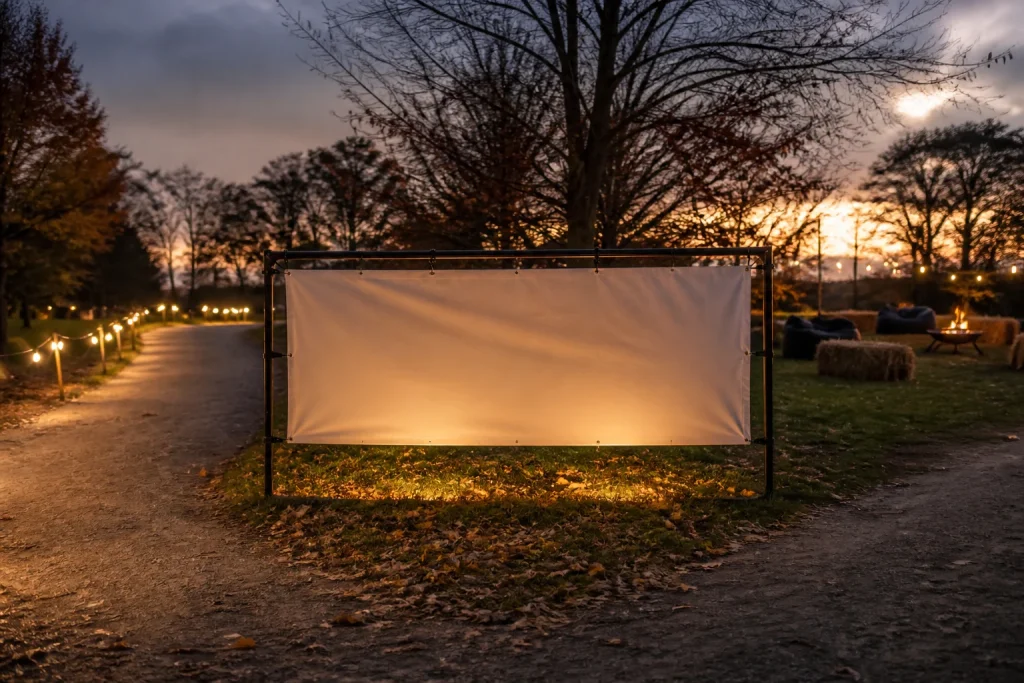
A banner should also suit its physical setting. PVC banners are one wide-format option, while a rigid sign or A-frame may make more sense for a particular route or surface. Fixings, display method, venue rules and exposure should be discussed for the specific site rather than assumed from the artwork alone.
Make the artwork easy to scan at a distance
Quiet-zone signage benefits from restraint. Give the main words generous space, use a typeface that remains legible when enlarged and maintain clear contrast between lettering and its background. Seasonal illustrations can support the event atmosphere, but they should not sit behind the words or create visual noise around the key label.
Common mistakes include squeezing in a full event timetable, using a thin decorative font, or placing vital text too close to the edge. Leave a sensible safe area around essential wording and ask the printer for the artwork specification before finalising the file. That is particularly useful when a design includes a border, arrow or full-bleed colour.
When custom Guy Fawkes banners are not the right answer
A large banner is not automatically the best way to communicate every quiet-zone detail. If visitors need to know changing information, such as whether a space is temporarily full or which steward to speak to, a smaller temporary sign may be easier to update. Printed banners work best for messages that are unlikely to change between artwork approval and the event.
Nor should a banner carry instructions that require active management. It can identify a quieter area, but it cannot replace suitable event planning, stewarding or any site-specific safety arrangements. Where the route is complicated, use a sequence of simple directional displays rather than one distant banner attempting to explain the whole journey.
It may also be sensible to use a different format indoors, in narrow corridors or where there is little uninterrupted wall or fence space. The right choice begins with the location and viewing distance, not with a preferred product.
Prepare custom Guy Fawkes banners with a useful brief
A clear brief reduces avoidable back-and-forth and helps a printer advise on a bespoke banner. Include the exact final wording, finished size if known, whether the banner needs an arrow, the intended display location, artwork files and any required brand colours. If the banner forms part of a wider set, identify the other signs so that the wording and visual hierarchy stay consistent.
Ask for help early if the message is still taking shape. Newstyle Print provides wide-format printing and design support for bespoke print work, so organisers can discuss the banner’s purpose alongside its artwork requirements. Checking the final proof carefully remains essential: confirm spelling, arrows, dates, logos and the position of every key message before approval.
Conclusion
A well-planned quiet-zone banner gives visitors a simple answer at the moment they need it. Keep the wording brief, separate it from promotional messaging and place it along the natural visitor route. By treating the banner as one part of a coordinated signage plan, rather than a catch-all noticeboard, you can make a busy Guy Fawkes event easier to understand without adding more visual clutter.