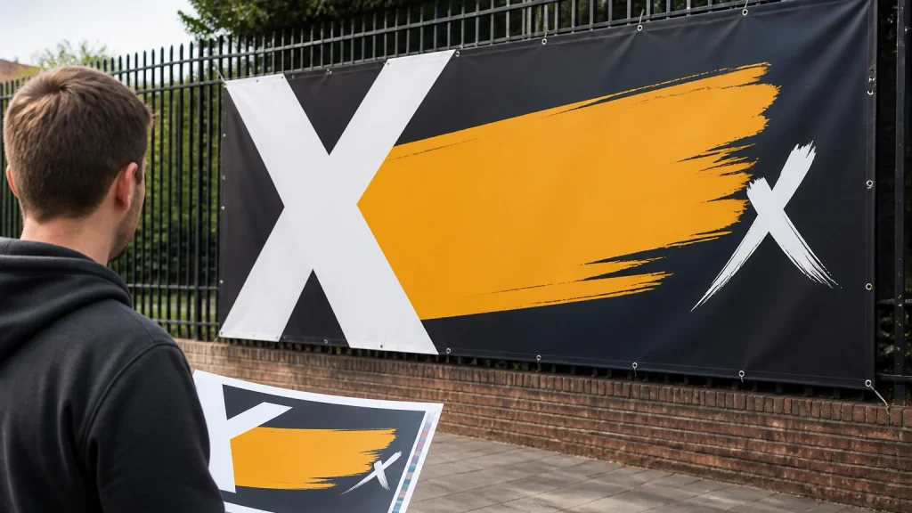
Banner Artwork for custom vinyl banner printing UK projects needs to communicate quickly from a distance. A short message, large readable type, clear contrast and a carefully chosen visual will usually do more than a layout filled with detail. Before choosing colours or images, decide what a passer-by needs to understand in a brief glance.
⏱️ Estimated reading time: 6 minutes
Table of Contents
- Start Banner Artwork with the viewing situation
- Build clear hierarchy for custom vinyl banner printing UK
- Choose type that remains legible at a glance
- Use contrast in custom vinyl banner printing UK designs
- Give images and logos room to work
- Prepare files for custom vinyl banner printing UK
- When a detailed banner is the wrong choice
- Conclusion
Start Banner Artwork with the viewing situation
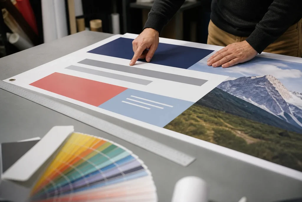
Write a simple priority list before opening the design file. In many cases, it includes a main message, the business or event name, and one useful detail or action. That detail might be a date, location, web address or phone number. If every item is treated as equally important, the reader has no clear place to start. The banner should still make sense if only its largest words are noticed.
Build clear hierarchy for custom vinyl banner printing UK
Give the headline the most space, then let supporting copy play a genuinely supporting role. A viewer should understand the banner’s purpose without having to read every line.
Keep the headline short where possible. “Summer Fair This Saturday” is easier to grasp at a glance than a longer explanatory sentence.
Leave space around key words, logos and images. Empty space is not wasted space when it separates information and prevents crowding.
Read the design in sequence: headline first, organiser second, then the next useful detail. If the eye moves instead to a small logo, a busy photograph or several competing offers, simplify the layout. Hierarchy is about what is noticed first, not simply making one element larger.
Choose type that remains legible at a glance
Readable banner type is clean, well spaced and easy to distinguish. Decorative scripts and very condensed fonts can look appealing on screen but may be difficult to read from a distance.
Use a limited type palette. One font family with different weights can be enough for a headline and supporting line. Combining several unrelated fonts often introduces visual noise and makes it harder to establish a reading order.
Use capitals selectively. A short word may gain presence in capitals, while a long all-capital message can be slower to scan. Sentence case or title case may be easier to read, depending on the wording. Avoid squeezing letters closer together merely to fit extra copy into the available area.
Before approval, view a small proof from further away and look at the artwork at a reduced on-screen size. These checks may reveal whether the essential words still carry the design. They are useful indicators, although they do not fully reproduce the final display location or lighting conditions.
Use contrast in custom vinyl banner printing UK designs
Contrast separates text from its background. Dark lettering on a light, plain area, or light lettering on a dark, plain area, is generally easier to read than text placed directly over a detailed photograph.
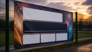
Photographs can add atmosphere for events, hospitality businesses or community campaigns. The common problem is placing small copy over the busiest part of the image. Reserve a calmer area for text, use a solid colour panel, or add a restrained overlay behind the words. Check that the headline remains clear rather than merely visible.
Make important information clear through wording, size and placement as well. Meaning should not depend only on a colour difference that some viewers may miss or that may appear differently in varied lighting. Symbols, labels and a direct written message can provide useful reinforcement where appropriate.
Give images and logos room to work
Choose one strong visual rather than several smaller pictures. Crop it with purpose: a product, person or focal feature should remain recognisable at the intended viewing distance.
Use the most suitable logo version available from a source file supplied by the organisation. A low-quality logo enlarged to banner scale can appear soft or uneven in print. Equally, a technically sharp but very small logo may have little value for distant viewers. Consider whether the logo needs prominence or simply a clear, consistent position.
For custom vinyl banner printing UK work, share the intended size, display location and available brand files with the printer early. Newstyle Print offers free artwork checks, which can help identify avoidable file issues before production.
Prepare files for custom vinyl banner printing UK
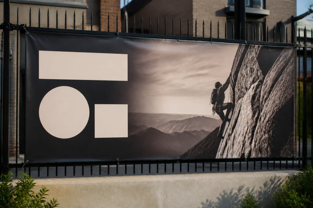
Create the artwork at the final proportion, even if it is produced at a reduced working scale. This helps prevent unwanted stretching and makes it easier to judge the composition. Keep text, logos and other important elements away from edges, hems, eyelets and finishing areas.
The precise safe area, bleed and finishing requirements can vary by banner product and supplier. Supply images and graphics at a quality suitable for their final printed size; enlarging a web image may cause blurring or visible pixels. Vector logos can be useful because they scale cleanly, although photographs still need appropriate image quality.
Ask the printer for current artwork requirements before exporting the final file. File formats, colour settings and production workflows can differ.
When a detailed banner is the wrong choice
A banner is not the right format for every message. If readers need to compare prices, study a timetable, follow instructions or understand several services, a leaflet, poster series, menu or web page may work better alongside it. Trying to force detailed content onto one banner often weakens the main message.
Another frequent error is treating a banner as a miniature website. Contact details, social media handles, service lists, taglines and multiple offers can quickly overwhelm the layout.
Conclusion
Effective distant-viewing banner artwork is focused rather than busy. Start with the viewing situation, lead with a short message, use legible type and protect text with clear contrast. Then check the final file against the current requirements provided for the chosen banner product and finishing method.
Ask whether a passer-by can identify the purpose, organiser and next useful detail in a brief glance. If not, reduce the copy, strengthen the headline or move supporting information to a format intended for closer reading. A clear banner does not need to explain everything; it needs to make the intended point easy to notice and remember at the right time.