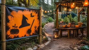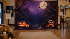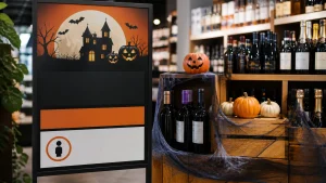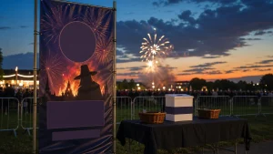
Halloween PVC banners can label themed activities clearly, helping visitors understand where to go without interrupting the atmosphere you have worked to create. At an attraction, shop event, family trail or hospitality venue, a well-planned banner can identify a pumpkin-carving table, haunted maze entrance, face-painting area or prize collection point at a glance. The important part is not simply adding Halloween graphics. Each banner needs one clear job, wording that makes sense from the approach, and a position that suits the way people move through the space.
⏱️ Estimated reading time: 6 minutes
Table of Contents
Start with the visitor journey
Before choosing colours, characters or spooky typefaces, map the visitor journey. Consider the questions people are likely to have on arrival: where an activity begins, where to wait, who it suits and where to go next. A themed activity sign should answer one question. Name each place briefly and uniquely. “Witch’s Potion Station” identifies a destination; “Collect your ingredients here” gives an instruction. Combining both with opening times, prices, social accounts and several logos usually makes the sign harder to use. For a hypothetical trail, show the overall route once at the welcome point, then use station signs with a name and a short action, such as “Find the hidden bat”. List every entrance, activity, queue and collection point. Decide what visitors need before reaching each one. Put changing session details on separate temporary notices where possible. That process exposes gaps, including a queue with no clear start marked clearly.
Make Halloween PVC banners readable first
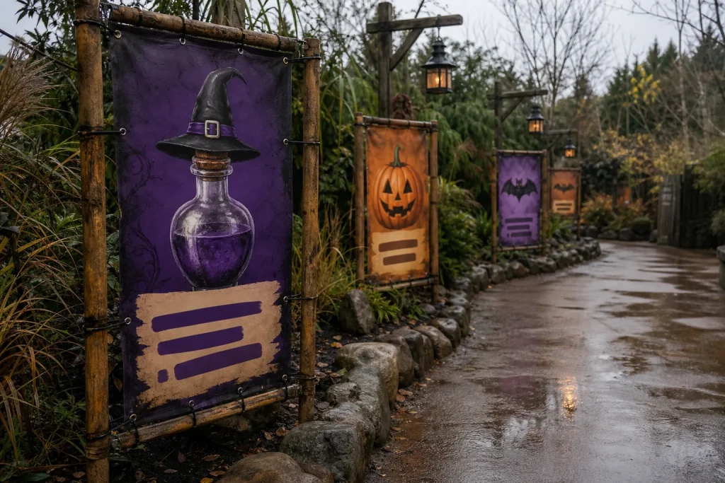
Readability comes before decoration. Put the activity name in the largest type, add a supporting instruction only when it helps, and leave plain background around essential words. Contrast matters more than any fixed Halloween palette: orange lettering over a busy black-and-purple illustration may fit the theme yet remain difficult to read. A dark background with light lettering, or a light panel behind the wording, can separate the message. Check artwork at reduced size on screen and from several steps away. If the main words disappear, simplify the layout rather than enlarging every element.
Use decorative horror-style lettering sparingly. It may suit a short title, but practical instructions such as “Entry”, “Please wait here” and “Collect your token” need a straightforward font. Keep the hierarchy simple: destination first, one action second, then a small pumpkin, spider or potion-bottle cue. Branding or sponsor recognition belongs last, only if it does not compete. Different icons can distinguish stations; shared colours and type treatments can still make the event feel connected and coherent overall.
Choose Halloween PVC banners for each location
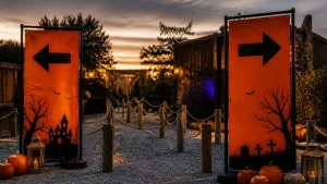
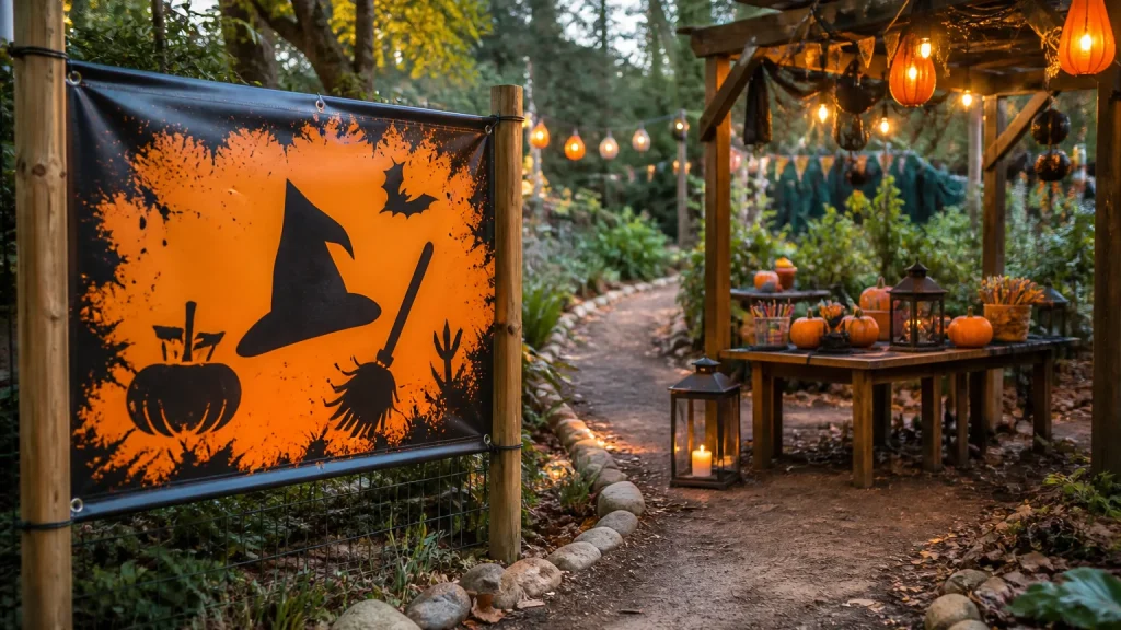
Not every activity needs the same display. A large banner above an entrance can introduce a prominent attraction, while a smaller directional sign may point visitors towards a quieter craft table. Consider where the banner will be seen, whether people are walking or queuing, and what fixing or display options are available. PVC banners are a wide-format option for event signage, but final size, eyelets and fixing method depend on the location and display plan. Discuss placement with the print supplier before finalising artwork. A banner for a fence may need a different approach from one for an indoor wall or temporary frame. Where an event has several zones, repeat the activity name at the precise point visitors make a decision. An overview board at the entrance may not be enough where a route splits later. Repeating the full programme on every banner, though, creates clutter and squeezes out local instructions. Match the role to the message: introduce, direct, identify or explain.
Common mistakes with Halloween PVC banners
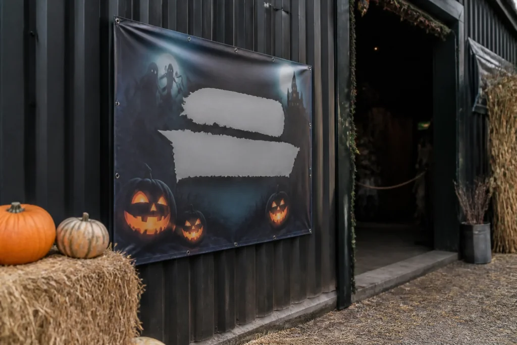
The common mistake is treating an activity sign as an advert. Promotion belongs at an entrance or in advance publicity; wayfinding must be quicker and calmer. Someone looking for “Monster Mask Making” does not need a paragraph about the event. Another mistake is designing activities independently. Artwork can vary, but unrelated colours, typefaces and message styles can make the route confusing. Agree a simple system before production: title font, core colours, icon style and a consistent logo position.
Do not rely on colour alone to distinguish activities. Pair colour with names, icons or simple symbols, especially when signs appear together. Check wording before approving artwork: a typo, missing arrow or outdated time can weaken an otherwise useful display. Avoid low placement for essential instructions, where queues, tables or decorations may obscure them. Walk the route as a visitor would, and ask someone unfamiliar with the layout to find each activity using the proposed signs. Their hesitation can uncover issues the organising team has missed.
When a PVC banner is not the best answer
Halloween PVC banners are not automatically right for every message. A narrow directional prompt may suit a board sign, A-frame or small poster, depending on available space and how often information changes. A detailed timetable or list of terms may need a format visitors can read closely, rather than a banner intended to be noticed farther away.
There is a trade-off between a heavily themed display and a reusable one. A banner with a broad label such as “Halloween Activities” may be usable beyond one date, while a design carrying a year, ticket instruction or one-off schedule is less flexible. Neither is wrong; decide whether the message is likely to return unchanged. For an unusual layout, prepare a bespoke print brief with intended location, approximate viewing position, final wording and any supplied artwork. State whether design help is needed. Newstyle Print offers PVC banners, wide-format printing and design support, so a clear brief helps discuss a suitable printed solution early.
Conclusion
Themed activity signs work when visitors can find, understand and enjoy each Halloween feature without asking for directions. Give every banner one role, prioritise readable wording over decoration, and plan the full route rather than designing signs in isolation. For an unusual layout or coordinated set of displays, prepare a location plan and artwork brief before requesting a print quote. Include the final message, where each banner will sit, and the information that may change.