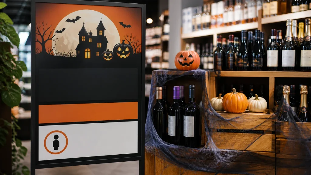
Halloween poster printing can help retailers present age guidance clearly alongside a seasonal offer, provided the message is accurate, approved and easy to spot. A poster should not try to interpret rules on its own. Its job is to repeat your business’s confirmed policy or required wording in a calm, readable way, so staff and customers see the same information at the point of decision.
⏱️ Estimated reading time: 5 minutes
Table of Contents
- Why Halloween poster printing needs clear age guidance
- Start Halloween poster printing with approved wording
- Design Halloween poster printing for quick reading
- Match poster size and placement to the decision point
- Common mistakes with age-guidance posters
- When Halloween poster printing does not make sense
- Conclusion
Why Halloween poster printing needs clear age guidance
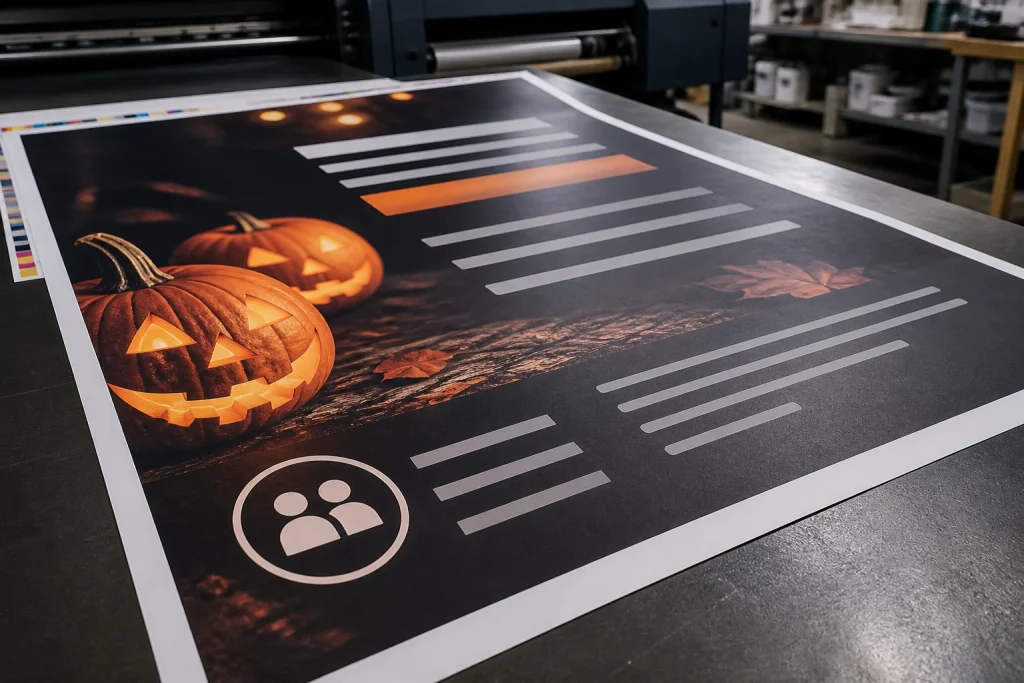
Seasonal displays tend to be busy. Dark colours, novelty graphics, limited-time offers and product imagery can all compete for attention. If a promotion concerns goods with an age restriction, age guidance should not become a small footnote squeezed into a corner. It needs a deliberate place in the layout.
Clear printed guidance can support a more consistent customer experience. A customer can see the policy before reaching the till, while staff have a visible reference if a conversation is needed.
Keep the poster’s purpose narrow. It might promote a Halloween range, explain an approved age-check policy, or direct customers to ask a member of staff.
Start Halloween poster printing with approved wording
Before choosing colours, size or paper, settle the exact wording. Ask the person responsible for policy, licensing or compliance to provide the statement that must appear. This matters because age rules and retailer policies can vary by product type and setting. A generic phrase borrowed from another shop, campaign or online template may be unsuitable for your situation.
Use the approved wording without creative rewriting. If the policy needs a particular age, condition or instruction, preserve it exactly.
- Write down the product or promotion covered by the poster.
- Confirm the final policy wording with the appropriate person in your organisation.
- Identify where customers will first encounter the message.
- Decide whether staff need a separate counter notice or internal prompt.
- Keep a dated, approved artwork version for future reprints.
A hypothetical convenience retailer running a Halloween display might use one promotional poster near the entrance and a separate, policy-led notice at the relevant product area or till.
Design Halloween poster printing for quick reading
A clear hierarchy is more useful than an elaborate Halloween theme. Start with the essential age guidance, then add the seasonal promotion, product image and brand details in descending order of importance. Someone standing briefly in front of the poster should be able to identify what it concerns and what action is expected without reading every line.
Contrast deserves particular care. Orange on black can feel suitably seasonal, yet not every orange-and-black combination remains easy to read at a distance or under varied shop lighting. Test the actual wording at its intended size rather than judging it only on a bright computer screen. Pale text over a detailed cobweb, smoke or pumpkin background is another frequent problem.
Choose straightforward typefaces for policy text and avoid decorative Halloween fonts for the main instruction. Stylised lettering can work for a short campaign heading, but it is a poor choice for details customers need to read accurately. Leave clear space around the statement too; visual breathing room often makes a notice more noticeable.
Match poster size and placement to the decision point
The right poster size depends on where it will be seen, how close people can stand and how much information it contains. A small counter poster may suit a short, focused instruction. A larger wall poster may be more appropriate where customers need to see the message before joining a queue or selecting an item.
Walk the customer route before finalising the artwork. Look from the entrance, along the aisle, at the display and from the payment point. A message hidden behind stock, reflected in a window or placed below normal sightlines is less useful, however well printed it is.
Consider using more than one version when the journey changes. For example, a larger poster can introduce the guidance near the display, while a concise version at the counter reinforces it. Keep the words consistent across both.
Common mistakes with age-guidance posters
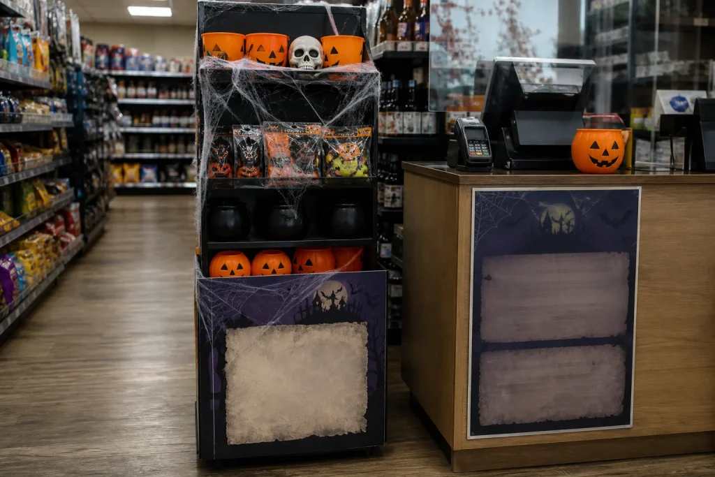
The most common mistake is treating the age statement as a compliance box to tick after the creative work is complete. That normally leads to cramped type, poor contrast and last-minute edits.
- Using unapproved wording: do not assume a familiar phrase fits every product or policy.
- Making the message too small: a readable design on screen can become difficult to read in store.
- Overloading the poster: several offers, prices, exclusions and images can bury the main instruction.
- Relying on colour alone: use clear words and structure, not just a warning-colour background.
- Skipping the proof check: review spelling, dates, prices, product names and the approved statement before print.
Ask someone who was not involved in the design to look at the proof for a few seconds. If they cannot explain the main message back to you, the hierarchy probably needs work. That small test is not a legal check, but it can expose a practical readability issue.
When Halloween poster printing does not make sense
A poster is not always the best answer. If information changes frequently, a fixed printed notice may become out of date too quickly. If the message must be given personally or applies only after a specific customer interaction, staff procedures may be more appropriate than a broad display. Similarly, a detailed set of conditions may need a separate information sheet rather than tiny poster text.
Do not use a seasonal poster to make a complex policy look simpler than it is. Use it for a concise, approved message, then make sure staff know where customers can get fuller information when needed.
Conclusion
Effective Halloween poster printing puts accurate age guidance ahead of decoration. Confirm the wording first, give it a clear visual hierarchy, test it at the intended viewing distance and place it where customers make the relevant decision. A concise brief covering the approved message, location, size, campaign dates and artwork version will make the print stage more straightforward and help seasonal promotional posters stay clear.