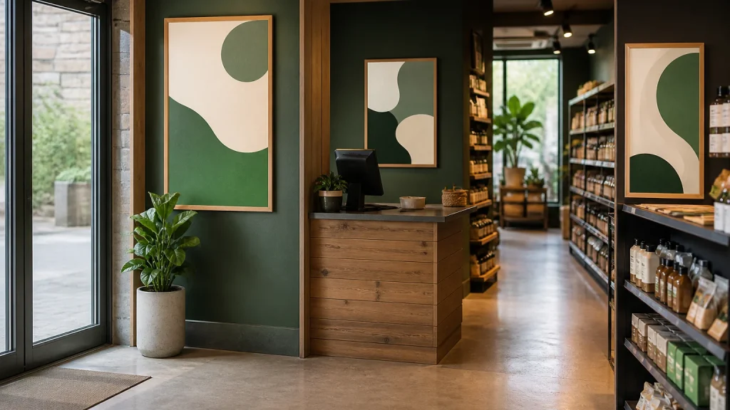
Poster printing is more useful when you plan where each poster will sit before settling on one design. Rather than repeating one artwork everywhere, create a small family of versions with the same campaign look but a message shaped for the location.
⏱️ Estimated reading time: 6 minutes
Table of Contents
A poster near a door can announce what is happening. One by a till can prompt a decision or a conversation. A poster in a queue may have room to explain an offer, a programme or a next step.
Plan poster printing around the customer journey
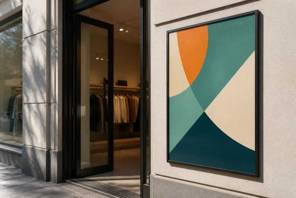
Walk through the space as a visitor would. Note the first point at which they can see the campaign, where they stop, where they wait and where they make a decision. You are not trying to map every wall. You are identifying a few moments when a printed message can be useful.
At an entrance, people are arriving and orientating themselves. They may only give a poster a quick glance, so the headline needs to carry the point. A café might use this position to announce a seasonal menu; a gym could flag a new class; a retailer may lead with a limited promotion. Keep supporting information brief and avoid filling the space with every condition, product or contact method.
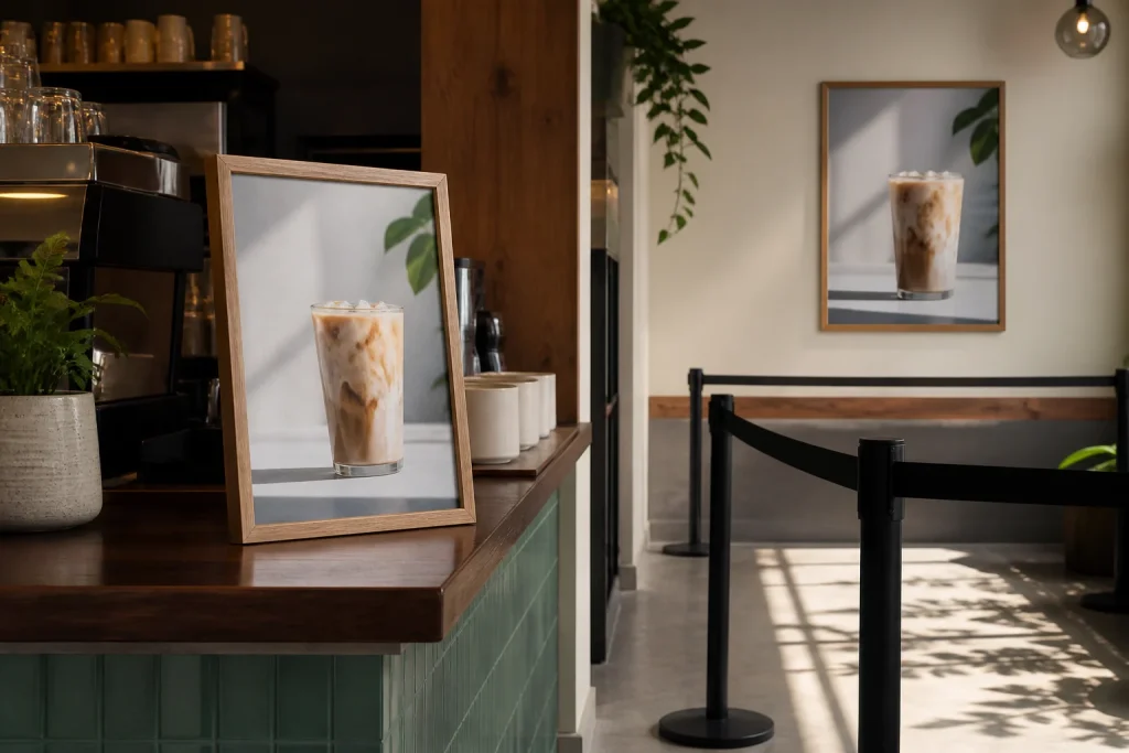
At a counter, people are closer to the poster and may have a short pause. That makes it a sensible place for an add-on, a reminder or a simple prompt to ask staff.
Placement also affects quantity. Count the approved positions after a site walk, then allow for replacements or later use only where that is genuinely likely. Ordering an arbitrary number because it sounds convenient can leave you with surplus campaign material or too few posters for the locations that matter.
Create versions for entrances, counters and queues
Use one visual system: the same logo position, colour palette, typefaces and campaign theme. Then change the hierarchy and level of detail.
| Location | Main task | Useful emphasis |
|---|---|---|
| Entrance | Make the campaign immediately clear | Short headline, key date or offer |
| Counter | Support a decision at close range | Specific prompt, price point or staff question |
| Queue or waiting area | Give interested people more to consider | Supporting detail, range or simple next action |
For example, a hypothetical hospitality venue promoting a lunch offer could use “Lunch served from 12” at the entrance. Near the counter, the version might show the meal choices or a clear upgrade prompt. In a waiting area, it could introduce a loyalty card or explain when the offer is available. Each poster supports the same campaign, but each respects the viewing context.
Do not treat a smaller version as simply a reduced file. When artwork shrinks, fine print, detailed images and long web addresses become harder to use. Rebuild the layout for the final size. Equally, enlarging a counter poster for a distant wall often produces a message that feels oddly empty because it was never designed to be read at a distance.
Poster printing needs a message for the viewing time
Decide what a person should understand after a glance, then what they might notice if they have longer. The first level is usually the offer, event, product category or directional instruction. The second can add dates, a short explanation, location details or a call to action. If the first level is unclear, extra copy rarely rescues it.
A useful test is to stand a realistic distance away from the artwork on screen and ask what remains. Can you identify the business, the central message and the action without reading every word? If not, simplify. Contrast, uncluttered space and a clear order of information generally matter more than decorative extras.
Images need the same discipline. Choose one image that strengthens the message rather than several small pictures competing for attention. Product-led posters may need a recognisable product image. An event poster might be better served by a strong date and a simple visual cue.
Build a practical poster printing brief
A clear brief avoids late changes and helps a printer advise on a suitable route. Start with the finished sizes required for each position, the number of each version, whether the design is single- or double-sided, and where the posters will be displayed. Mention any existing brand artwork, campaign assets and hard deadlines, but do not assume all poster materials or finishing options suit every setting.
Supply final copy early. A common mistake is treating wording as something to finish after the layout has been approved. A late change to an offer, date or price can alter line breaks, balance and emphasis across several versions. Keep one named person responsible for checking factual details, particularly dates, telephone numbers, opening information and promotional terms.
Before approval, review each version at its intended size. Check that logos are current, images are suitable for the printed dimensions, and important content is not pushed too close to the edge. If colour is central to brand recognition, provide the printer with the correct brand references where available. Newstyle Print can provide graphic design and layout assistance if artwork needs creating or refining before print.
When this approach does not make sense
Multiple versions are not always the sensible answer. If every poster will be viewed from roughly the same distance, carries a genuinely simple message and appears in similar positions, one well-designed version may be enough. Splitting a very small budget across too many designs can also make the campaign harder to manage without giving viewers a clearer experience.
The other trap is inconsistency. Different versions should not make different promises, use conflicting prices or point people towards competing actions. Create an approval sheet listing each placement, its version, final wording and quantity. It is a simple safeguard, especially when several people are involved.
Conclusion
Planned placement turns poster printing from a single artwork exercise into a clearer campaign system. Start with the route people take through the space, decide what each location must communicate, then create only the versions that earn their place. When you are ready to order, bring the placement list, quantities, final copy and available artwork together.