Hello to all our Newstyle Print readers out there! Whether you’re an established brand, a start-up, or simply an art enthusiast, there’s something timeless and captivating about a well-designed poster. The power of a poster is undeniable – it can inform, entertain, inspire, and persuade. Today, we’ll explore the art and science of creating a poster that truly stands out.
1. Understand Your Audience
Before diving into design specifics, the very first step is understanding who the poster is for. Your target audience’s preferences, behaviours, and needs will shape your design decisions. For instance, a poster aimed at tech professionals might be vastly different from one targeting vintage art lovers. By tailoring your message and design to your audience, you’re already setting your poster up for success.
2. Prioritise Your Information
Not all information is created equal. Decide what your primary message is and make sure it stands out. This could be an event date, a product name, or a call to action. Once the primary message is clear, you can then weave in secondary information without overwhelming the viewer.
3. Embrace the Power of Typography
Typography isn’t just about selecting a pretty font – it’s an art form in itself. Different fonts convey different emotions and can set the entire tone for your poster. A professional, clean font might be perfect for a corporate event, while a playful, handwritten font could be great for a children’s workshop. Remember:
- Consistency is key: Stick to 2-3 fonts to keep things cohesive.
- Hierarchy matters: Use font sizes and styles to indicate the importance of information.
4. Play with Colours
Colours are more than just visual elements; they evoke emotions. Vibrant reds might communicate urgency or passion, while calm blues could signify trustworthiness or serenity. Consider the following when selecting your palette:
- Contrast: Make sure there’s enough contrast between background and text for readability.
- Brand alignment: Ensure your colours align with your brand’s identity or the theme of the event.
- Colour psychology: Remember the emotions and associations tied to different colours.
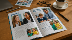
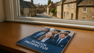
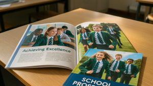
5. Use High-Quality Images
A stunning image can capture attention instantly. However:
- Resolution matters: Always use high-resolution images to ensure they look crisp and clear when printed.
- Relevance is crucial: Ensure the image aligns with your message and complements the other design elements.
6. Balance is Beautiful
Good design is often about balance. This doesn’t necessarily mean symmetry, but rather a harmonious arrangement of elements. Think about:
- Whitespace: Give your design elements room to breathe. Whitespace can help direct the viewer’s attention and reduce visual clutter.
- Alignment: Ensure elements are aligned, whether it’s text blocks, images, or logos. It makes your poster look structured and professional.
7. Call to Action (CTA)
If you’re using your poster to advertise or inform, consider including a clear CTA. Whether it’s “Buy Now”, “Visit Us”, or “Learn More”, make it standout but ensure it doesn’t overshadow the primary message.
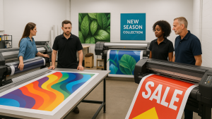
8. Printing Matters
The design is just one part of the equation. A fantastic design can fall flat if the printing isn’t up to par. Always:
- Select the right paper: Glossy might be great for vibrant designs, while matte could suit more subtle, artistic posters.
- Consider size: Think about where your poster will be displayed and choose a size that fits and stands out.
Conclusion: Embrace Iteration
Every poster is a learning opportunity. Gather feedback, assess what works and what doesn’t, and don’t be afraid to iterate. After all, the journey from concept to canvas is one of exploration and refinement.
And remember, when you’re ready to bring your poster design to life, the team at Newstyle Print is here to help. With our expertise in printing and passion for quality, we’ll ensure your vision is realised perfectly on paper.
[Contact Newstyle Print for more details or guidance on your next poster project.]