In an era dominated by digital marketing, it’s easy to overlook the timeless power of tangible advertising materials, especially flyers and leaflets. Yet, these paper-based promotional tools can deliver outstanding results, particularly for local businesses or event promotions.
However, like all marketing, flyers can only be effective if designed appropriately. A poorly designed flyer can easily go from a potential customer’s hand to the bin without a second thought. Let’s explore five common mistakes to avoid when designing your flyers, ensuring that your message doesn’t just land – but resonates.
1. Overloading Information
Less is More: One of the most frequent mistakes is cramming too much information onto a single flyer. A flyer inundated with words can deter your audience. Instead, use concise, engaging copy that gets straight to the point. Remember, your flyer is not a novel. It’s a quick snapshot meant to grab attention and communicate a clear message.
Tip: Break up your information with bullet points, headers, and visuals. This not only makes the flyer more digestible but also directs the reader’s eyes to essential points.
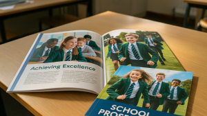
2. Poor Quality Imagery
First Impressions Count: The images on your flyers can make or break your message. Using low-resolution or irrelevant images can send the message that you don’t care about quality — and by extension, your potential customers.
Tip: Invest in high-quality imagery. If you don’t have original photographs, consider purchasing stock photos. Always ensure the images resonate with your brand and the specific message of your flyer.
3. Ignoring the Importance of Hierarchy
Prioritise Information: Not all information on your flyer holds equal weight. Decide what your primary message is, and make sure it stands out. Typically, this would be your headline or primary call-to-action.
Tip: Use size, boldness, and colour to emphasise key information. For instance, if you’re advertising a sale, the discount percentage or ‘SALE’ headline should be the most prominent.
4. Neglecting a Call-to-Action (CTA)
Direct Your Audience: What do you want recipients to do after reading your flyer? Whether it’s attending an event, visiting a store, or checking out a website, your CTA should be clear and compelling.
Tip: Use actionable language such as “Visit Today,” “Learn More,” or “Grab Yours Now.” Place the CTA in a noticeable spot, and consider using contrasting colours to make it pop.
5. Inconsistent Branding
Stay True to Your Identity: Your flyer is an extension of your brand. Using a different logo, varying colour schemes, or an off-brand tone of voice can confuse recipients and dilute your brand’s power.
Tip: Before finalising your flyer, cross-reference it with other marketing materials to ensure brand consistency. Maintain the same fonts, colours, and general style for a cohesive brand presentation.
Conclusion:
While it might be tempting to rush the design process of your flyer, it’s essential to give it the time and attention it deserves. After all, it serves as a tangible representation of your brand in the hands of potential customers or clients.
By avoiding these common pitfalls, you’ll be well on your way to creating flyers that not only capture attention but also drive action. At Newstyle Print, we’re here to assist you in your flyer journey, ensuring that every leaflet or flyer you produce is a beacon of your brand’s excellence. Whether it’s guiding you through design choices or ensuring top-notch printing quality, we’re your partners in effective flyer marketing.
Remember, in the world of marketing, it’s often the small details that make a big difference. Make every flyer count!
Note: This blog aims to guide businesses or individuals in designing effective flyers by highlighting common mistakes. Always align any advice or content with the specific needs and objectives of your audience.