⏱️ Estimated reading time: 5 minutes
Understanding the Purpose and Audience of Your Banner
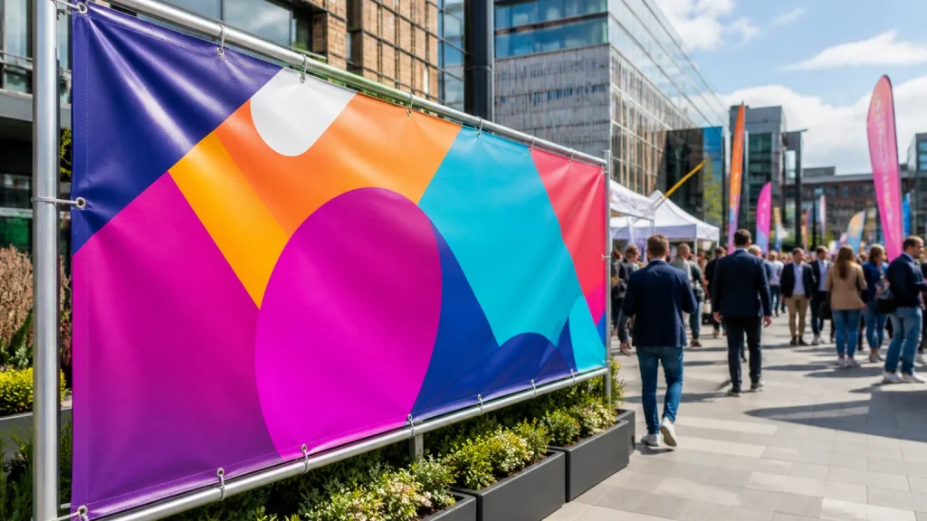
Before diving into the design process for custom banner printing in the UK, it’s crucial to clarify the banner’s purpose and intended audience. Whether it’s for promoting an event, advertising a product, or increasing brand visibility, the design should speak directly to the target audience. Knowing who will see your banner and where it will be displayed guides choices about size, colours, messaging, and imagery.
For instance, a banner aimed at a trade show audience might prioritise clear branding and concise product benefits, while a community event banner could use more vibrant graphics and friendly language. Understanding these nuances ensures your banner resonates effectively and delivers the intended impact.
Choosing the Right Size and Material for Your Banner
Banner size significantly influences how your message is perceived. A banner intended for outdoor use at a large event will require different dimensions and materials compared to one used indoors or in a smaller space. PVC banners, commonly used for outdoor displays, offer durability and weather resistance, while vinyl or mesh options may be better suited for specific conditions. Selecting the right material ensures your banner remains vibrant and intact throughout its display period.
Consider a hypothetical scenario where a business needs a banner for a windy outdoor market stall. In this case, a mesh banner is advantageous as it allows air to pass through, reducing the risk of damage.
Effective Use of Colours and Contrast
Colour choice is a powerful tool in banner design. High contrast between text and background improves readability from a distance. For example, dark text on a light background or vice versa tends to stand out well. It's best to limit the colour palette to maintain a clean and professional look, avoiding overly complex or clashing colours that can confuse the viewer.
When selecting colours, also consider the psychological effects they may have on viewers. Blues often evoke trust and professionalism, while reds can signal urgency or excitement.
Typography: Clarity and Readability Matter
Select fonts that are easy to read at a glance. Sans-serif fonts often work best for banners due to their clean lines. Avoid using more than two different fonts to keep the design cohesive. Size your text appropriately—headlines should be large enough to capture attention, while any supporting information should remain legible without overcrowding the layout. Remember that less is more; concise messaging is more likely to be remembered.
As a practical guideline, headline text should be at least 150pt for large outdoor banners viewed from a distance over 10 metres, while smaller banners or indoor displays can use proportionally smaller text. Keeping font weight consistent also aids legibility, so avoid mixing bold and light fonts excessively.
Incorporating Images and Graphics Wisely
Using high-quality images or graphics can enhance your banner's appeal, but they must be relevant and not overwhelm the overall message. Avoid cluttering the banner with too many elements. A single striking image or a well-designed logo can communicate your brand identity effectively.
Strategic Placement of Key Information
Your banner should prioritise information hierarchy. The most important message or call to action must be immediately visible, typically placed towards the centre or top third of the banner where the eye naturally falls.
Planning for Viewing Distance and Environment
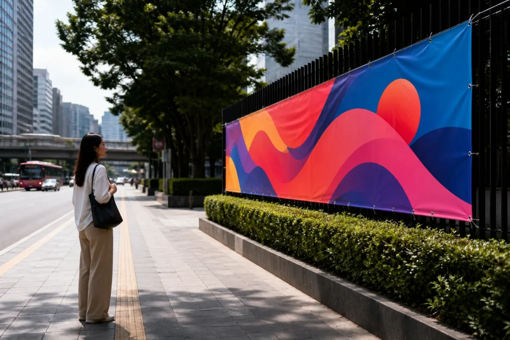
Consider where your banner will be displayed and the typical viewing distance. Large banners viewed from afar require bold text and simple designs, whereas banners seen up close can include finer details. Environmental factors such as lighting conditions and surrounding colours also affect how your banner will appear. For outdoor banners, durability against weather elements is another important factor in design choices.
Common Mistakes to Avoid in Custom Banner Design
A frequent error is overloading the banner with excessive text or graphics, which dilutes the message and reduces impact. Poor colour contrast can make text hard to read, especially in bright daylight. Using low-resolution images results in blurry prints that undermine professionalism. Not checking the artwork with the printer’s specifications can cause delays or additional costs.
Another common mistake is neglecting bleed and safe zones during design. For example, important text or logos placed too close to the edge risk being cut off during trimming.
Leveraging Professional Design and Printing Expertise
Collaborating with experienced printing services, such as Newstyle Print, can greatly enhance the final outcome of your custom banner.
Newstyle Print’s in-house graphic design team can also assist in optimising your design for print, advising on colour profiles, resolution, and layout adjustments. This collaboration can prevent costly reprints and ensure your banner meets both aesthetic and functional goals.
Conclusion
Creating a custom banner that captures attention requires thoughtful design decisions—starting from understanding the audience to choosing appropriate materials and colours. Prioritising clarity, simplicity, and professional quality increases the effectiveness of your banner as a marketing tool. When in doubt, consulting with a local, experienced printer with in-house design support can make a significant difference in achieving a striking and reliable banner that serves your business needs effectively.