⏱️ Estimated reading time: 7 minutes
- Grab Attention Fast with Smart Roller Banner Design
- Keep Your Message Clear and Concise
- Choose Colours That Pop — But Stay On Brand
- Use High-Quality Images and Graphics
- Consider Your Banner Size and Viewing Distance
- Don’t Forget the Finishing Touches
- Quick Case Example: Local Charity Event Banner
- Wrapping Up Your Roller Banner Design
Grab Attention Fast with Smart Roller Banner Design
We all know that first impressions count, especially at events or in busy retail spaces. Your roller banner needs to catch the eye in seconds and say exactly what you want — no more, no less. But it’s not just about bold colours or massive logos. Getting the balance right can make the difference between being noticed and being overlooked.
In this article, we’ll share some practical tips from our experience at Newstyle Print to help you design roller banners that truly deliver impact in 2025.
⏱️ Reading time: 7 minutes · Updated for 2025 · UK Printing Guide
Keep Your Message Clear and Concise
Here’s the thing: people usually glance at roller banners for just a few seconds. That means your headline needs to be punchy and easy to read from a distance. Avoid cramming in too much text — think of it as a billboard, not a brochure. Overloading your banner with information risks overwhelming viewers, causing them to simply walk past without absorbing your key message.
We’ve seen plenty of customers simplify their wording and boost engagement dramatically. Using large, legible fonts really helps. Stick to one main message plus perhaps a brief supporting line, but resist the temptation to add extra details. For example, a banner promoting a local bakery might say “Freshly Baked Every Morning” in big letters, with a smaller line below like “Artisan Breads & Pastries.” That’s far more effective than listing every product on offer.
Choose Colours That Pop — But Stay On Brand
Bright colours can certainly help you stand out in a busy environment, but they need to work well together and reflect your brand identity. When designing a banner for a tech startup, for instance, a combination of sleek blues and greys might convey professionalism better than neon hues. Conversely, a children’s charity event might benefit from vibrant reds and yellows to evoke energy and warmth.
If you’re unsure which colours will work best, asking for advice is a smart move. Newstyle Print offers help with colour matching to ensure your banner looks vibrant and professional, whether you’re using bold reds or subtle blues. Remember, contrast is key. Light text on a dark background or vice versa usually reads best from a distance, especially in dimly lit venues.
Use High-Quality Images and Graphics
Blurry or pixelated images are a surefire way to undermine your message. Always use artwork at the recommended resolution — usually 150-300 dpi for roller banners. Low-resolution images not only look unprofessional but can also distract from your message. We often see clients who’ve tried to use smartphone photos that don’t quite meet print standards, and it tends to hurt rather than help their cause.
During our free artwork check service, we can help fix or replace low-quality images. Sometimes, swapping out an image for a simple but striking graphic element can have more impact than a complicated photo. Consider the overall layout too: pairing a strong, clean image with minimal text often draws more attention than cluttered, busy designs.
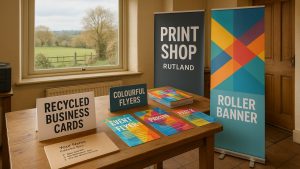
Consider Your Banner Size and Viewing Distance
Not all roller banners are created equal. Whether you’re going for a standard size or a wider stretch fabric display, it’s worth thinking carefully about where the banner will be placed. A banner intended for a cramped indoor exhibition hall will need bigger fonts and bolder elements than one designed for a small desk space.
For example, a banner displayed at a trade show across a large hall might be viewed from several meters away. In such cases, small typefaces or intricate details will likely be lost. On the other hand, a banner used at a checkout counter can afford to have finer print since viewers are closer. At Newstyle Print, we offer a range of roller banner options — from desktop versions to premium wide formats — so you can pick the right fit for your space and intended audience.
Don’t Forget the Finishing Touches
Sometimes it’s the little details that make all the difference. Finishes like matt or gloss lamination don’t just protect your banner; they can enhance its visual appeal and tactile feel. For example, gloss finishes tend to make colours pop and can look fantastic under bright lights, but they may produce glare in certain settings. Matt finishes reduce reflections and often look more sophisticated, which might suit corporate events better.
We’re happy to advise on finishes that suit your environment, whether it’s a sunny outdoor event or an indoor exhibition. In one recent case, a client’s banner was used outdoors on a windy day — the lamination helped protect it from moisture and dirt, extending its life considerably.
Quick Case Example: Local Charity Event Banner
We recently helped a local charity design a roller banner for their fundraising event. They wanted something eye-catching but hopeful, so we suggested a bright blue background with bold white text and a single powerful photograph. The photo featured a smiling child receiving aid, which really connected with visitors emotionally.
Thanks to clear messaging and sharp imagery, the banner drew more visitors to their stand than in previous years. This suggests that thoughtful design—balancing colour choice, image quality, and message clarity—can genuinely boost real-world results. It also reinforced the importance of tailoring design elements specifically to the audience and event atmosphere.
Need help with your printing?
We offer free artwork checks, friendly advice, and fast UK delivery.
Wrapping Up Your Roller Banner Design
Designing roller banners that truly stand out isn’t rocket science, but it does take some careful thought. Keeping your message simple, your images sharp, and your colours on-brand are the foundations. It’s easy to get carried away with flashy graphics or too many words, but the best banners communicate quickly and clearly.
Don’t hesitate to lean on print professionals like Newstyle Print to guide you through choices of size, finish, and artwork tweaks. Their experience with various projects—from litho to wide-format printing—can save you headaches and improve your final product.
If you’d like advice on printing, we’re always happy to help — free artwork check included.
⭐ 4.9/5 Google Rating · 10+ Years in Business · Free Delivery UK-Wide
Written by Taylor Reed
Print Expert at newstyleprint.co.uk. They share practical insights from hands-on print work across litho, digital and wide-format projects.
Updated on 22 December 2025
Ready to print? Contact Newstyle Print for a fast quote today.
Call 01572 771377 or email hello@newstyleprint.co.uk
Get a quote »