⏱️ Estimated reading time: 6 minutes
Getting Your Christmas Flyers Noticed Amid the Festive Rush
It’s that time of year when shopping centres transform into lively hubs brimming with twinkling lights, festive tunes, and a flood of Christmas flyers all competing for attention. You might be scratching your head wondering how to make your flyers stand out when the noise level is sky-high and the competition fierce. But don’t stress—we’re here to share some straightforward advice to help your flyers catch the eye and not get lost in the shuffle.
Design with the Shopper in Mind
Start by putting yourself in the shoes of the busy shopper. Picture someone juggling multiple shopping bags, a phone in one hand, and a mental checklist of gifts they still need to grab. Your flyer needs to communicate its message almost instantly. That means bold, clear headlines and a layout that isn’t cluttered with too many competing elements. Festive colours? Yes—but used judiciously. Too intense, and the flyer ends up looking like a visual assault rather than a festive invitation.
Consider mixing traditional Christmas motifs with a bit of personality. For instance, instead of a classic Christmas tree photo, how about a quirky illustration of a tree made of wrapped presents, or a candid shot of a local family enjoying a winter market? These touches can subtly separate your flyer from the dozens of others on the rack. Just be mindful that while being creative, the flyer should never sacrifice clarity for flair. A shopper should know within seconds what you’re offering.
Use Contrast and Hierarchy
Contrast is your secret weapon. Think of pairing colours that evoke the festive spirit but also create clear visual separation—red and white, green and gold, or even deep navy with silver accents. These combinations can help important details like limited-time offers and event dates jump out. Also, use typographic hierarchy to your advantage: larger, bolder fonts for the headline, medium weight for subheadings, and smaller text for details. This visual roadmap guides a hurried reader effortlessly through your flyer.
Choose Paper That Feels Festive and Sturdy
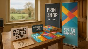
Picking the right paper might seem like a small detail compared to flashy design, but it’s actually a major factor in how your flyer is perceived. A flyer printed on thin, glossy paper might look cheap and get tossed aside quickly. On the other hand, a thicker, uncoated or lightly textured stock offers a pleasant tactile experience that makes people want to hold onto it. It also conveys quality and care, which reflects back on your brand or event.
For those mindful of sustainability, eco-friendly options have come a long way. Newstyle Print, for example, offers recycled stocks that don’t compromise on feel or appearance. Choosing such papers sends a subtle message that your brand cares about the environment, which many shoppers appreciate these days. It’s not just good for the planet; it can enhance your flyer’s appeal in a subtle yet meaningful way.
Consider Finishes That Add a Touch of Magic
Adding a finish like matt lamination or spot gloss can be a game changer. These finishes give your flyer a slight sheen or a velvety texture that catches light and attention without being gaudy. Spot glossing, in particular, lets you highlight specific elements—like your logo or an enticing product photo—adding a layer of sophistication. Just be cautious not to overdo it; too much gloss can feel tacky rather than tasteful.
Timing and Distribution Matter
Getting your flyers printed is only half the battle. When and where you distribute them is equally important. Aim to have your flyers ready at least two weeks before the busiest shopping days. This gives you the flexibility to place them strategically—in local shops, at community events, or handed out in areas with heavy foot traffic. Timing your distribution to coincide with when shoppers are planning their purchases can increase the chances your flyer will actually influence their decisions.
Case Study: A Local Charity’s Festive Flyer Success
Not too long ago, we worked with a local charity that wanted to promote their seasonal market stall. They chose warm, inviting colours paired with clear, easy-to-read fonts, printed on soft-touch recycled paper. The tactile quality of the flyer stood out among other glossy, slick promotional materials, making people more inclined to pick it up and keep it. The charity noticed a significant increase in visitors to their stall, many of whom mentioned the flyer’s feel as a reason it caught their attention. It’s a small detail but one that made a real difference.
Wrapping It Up
Creating Christmas flyers that genuinely stand out doesn’t have to be an overwhelming challenge. Concentrate on clear, festive design that respects the busy nature of shoppers. Select paper that feels good to touch and finishes that add subtle flair. And don’t forget to plan your timing and distribution carefully to maximize your flyers’ impact. Together, these elements can transform your flyers from just another piece of paper into a memorable festive touchpoint.
While we’re here to help with Christmas flyer printing—offering free artwork checks and friendly advice on stock, finishes, and formats—remember that the magic often happens in the details you choose. Sometimes, it’s the subtle choices that make the biggest impression.
Happy printing, and here’s hoping your festive flyers bring joy to both you and your audience this holiday season!
Need help with your printing?
We offer free artwork checks, friendly advice, and fast UK delivery.
If you’d like advice on printing, we’re always happy to help — free artwork check included.
⭐ 4.9/5 Google Rating · 10+ Years in Business · Free Delivery UK-Wide
Written by Taylor Reed
Print Expert at newstyleprint.co.uk. They share practical insights from hands-on print work across litho, digital and wide-format projects.
Updated on 19 November 2025
Ready to print? Contact Newstyle Print for a fast quote today.
Call 01572 771377 or email hello@newstyleprint.co.uk
Get a quote »