⏱️ Estimated reading time: 7 minutes
Why Festive A-Board Posters Matter for Walk-In Traffic
When the festive season rolls around, your shop window and entrance become the first point of contact with potential customers. A well-designed A-board poster can be a real game-changer, catching the eye of passers-by and inviting them inside. But it’s not just about slapping on some tinsel and a generic message—there’s a bit of art and strategy behind crafting posters that truly resonate.
It might be tempting to think that any festive decoration will do the trick, but the reality is a bit more nuanced. People are bombarded with visual noise during the holidays, so your poster needs to stand out in a way that feels genuine and relevant. A festive A-board that blends creativity with clarity has the power to turn casual foot traffic into real customers, and that’s where the subtle details come into play.
Tips for Creating Festive A-Board Posters That Work
1. Keep Your Message Clear and Cheerful
People often have just a few seconds to glance at your A-board as they walk past. So, simplicity is key. Use short, friendly phrases that evoke a festive feeling but also highlight what you’re offering—whether it’s a special seasonal discount, a new product, or a warm welcome.
For instance, instead of a lengthy paragraph about your holiday menu, a phrase like “Warm up with festive treats!” or “Holiday deals inside!” can quickly communicate your message. Overloading your board with too much text may overwhelm or confuse, causing potential customers to simply walk on by.
2. Choose Bold Colours with Care
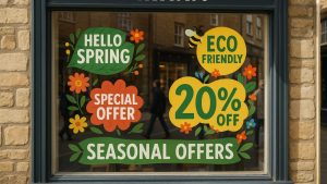
Festive colours like red, green, gold, and white are classics for a reason—they immediately signal the season. But beware of overdoing it. Contrast is crucial for readability; for example, bright red text on a dark background can pop, but too many competing colours make it hard to focus.
Interestingly, some businesses have experimented with less traditional palettes—like icy blues combined with silver accents—that still evoke the holiday spirit without the clichés. This can be especially effective if you want to stand apart from the sea of reds and greens without losing that festive feeling. Just remember, whatever colours you pick, the text must be easy to read from a distance.
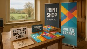
3. Use High-Quality Images and Graphics
Blurry or pixelated images can do more harm than good. If you’re including festive icons—like snowflakes, holly, or baubles—make sure they’re crisp and well-placed. Newstyle Print offers free artwork checks, so if you’re unsure about your files, you can always send them over for a quick review.
It’s also worth thinking about how many graphics to include. A few well-chosen, sharp images can complement your message without cluttering the space. For example, a single tasteful snowflake placed near your headline can add a subtle seasonal touch without distracting from your main offer.
4. Think About Your Typeface
Fonts that are too fancy or ornate might look festive but can be tricky to read from a distance. Go for bold, clear fonts that work well outdoors. Mixing a playful header font with a simple body font often strikes the right balance.
Sometimes, businesses opt for fonts that look handwritten or script-like to add a cozy and personal feel, but it’s important to test how these fonts perform from across the street. If passers-by have to squint or stop to decipher your message, you risk losing their interest. A good rule of thumb is to test your design at full size before printing.
5. Consider Material and Finish for Impact
The right paper stock and finish can make your poster stand out. Matte finishes reduce glare—helpful if your A-board will sit in direct sunlight—while a gloss finish can make colours pop indoors. At Newstyle Print, you can explore options like recycled poster stocks if you want to keep things eco-friendly without compromising quality.
In some cases, businesses have found that textured paper stocks add an unexpected tactile element that makes their posters feel more premium and inviting. It’s a subtle detail that may not be noticed at first glance but can influence the overall perception of your brand.
6. Placement and Size Matter
It might sound obvious, but where you place your A-board is as important as how it looks. Position it where foot traffic is heaviest, and ensure it’s stable and visible. Larger sizes are great for busy streets, but in tighter spaces, a smaller, well-designed poster can be just as effective.
Sometimes, the best spot isn’t right in front of your door but perhaps slightly to the side where people naturally pause—like near a pedestrian crossing or a bus stop. Observing your local foot traffic patterns for a day or two before deciding can be surprisingly helpful.
A Quick Example: How a Local Cafe Brightened Up Its Footfall
One of our customers, a cosy neighbourhood cafe, wanted to attract more festive visitors. They chose a bright red recycled poster with bold white text saying “Warm up with our festive specials!” They kept the design simple with a few tasteful snowflake graphics and used a matte finish to avoid glare in the winter sun.
Placed right outside their entrance where foot traffic was highest, the poster drew plenty of attention. They also took advantage of Newstyle Print’s free artwork check to make sure everything looked spot on before printing.
The result? A noticeable bump in walk-ins over the festive weeks and several compliments from customers about the inviting look. It’s a great example of how thoughtful design and quality printing combine to make a real difference.
Wrapping It Up
Designing festive A-board posters isn’t just about putting up seasonal decorations—it’s about connecting with your community and inviting them in with warmth and clarity. Remember, the best posters are those that speak directly to your audience, look professional, and hold up well in the elements.
If you’re planning your festive A-board posters, Newstyle Print can help you pick the right paper, finish, and design tips to make your campaign a success. You’re welcome to email your artwork for a free check or chat with us about what will work best for your location and budget.
With a bit of care and the right print partner, your festive posters will do more than just brighten the street—they’ll bring more friendly faces through your door.
If you’d like advice on printing, we’re always happy to help — free artwork check included.
⭐ 4.9/5 Google Rating · 10+ Years in Business · Free Delivery UK-Wide
Written by Taylor Reed
Print Expert at newstyleprint.co.uk. They share practical insights from hands-on print work across litho, digital and wide-format projects.
Updated on 20 November 2025
Ready to print? Contact Newstyle Print for a fast quote today.
Call 01572 771377 or email hello@newstyleprint.co.uk
Get a quote »